Graphics

Wispeed

A visual identity redesign created to strengthen brand recognition and improve consistency across digital touchpoints.

Graphics

Wispeed

A visual identity redesign created to strengthen brand recognition and improve consistency across digital touchpoints.

Metadata

•  Role: Graphic Designer

•  Timeline: 2 weeks

•  Tools: Illustrator, Photoshop

•  Deliverables: Visual Identity, Packaging, Poster

The Overview

A scalable digital brand system designed to modernize Wispeed’s visual identity and communication.


Source : https://wispeed.net/

Source : https://wispeed.net/

About The Brand

Urban micro-mobility company producing sleek, eco-friendly electric scooters for daily city commuters.

Actual Content

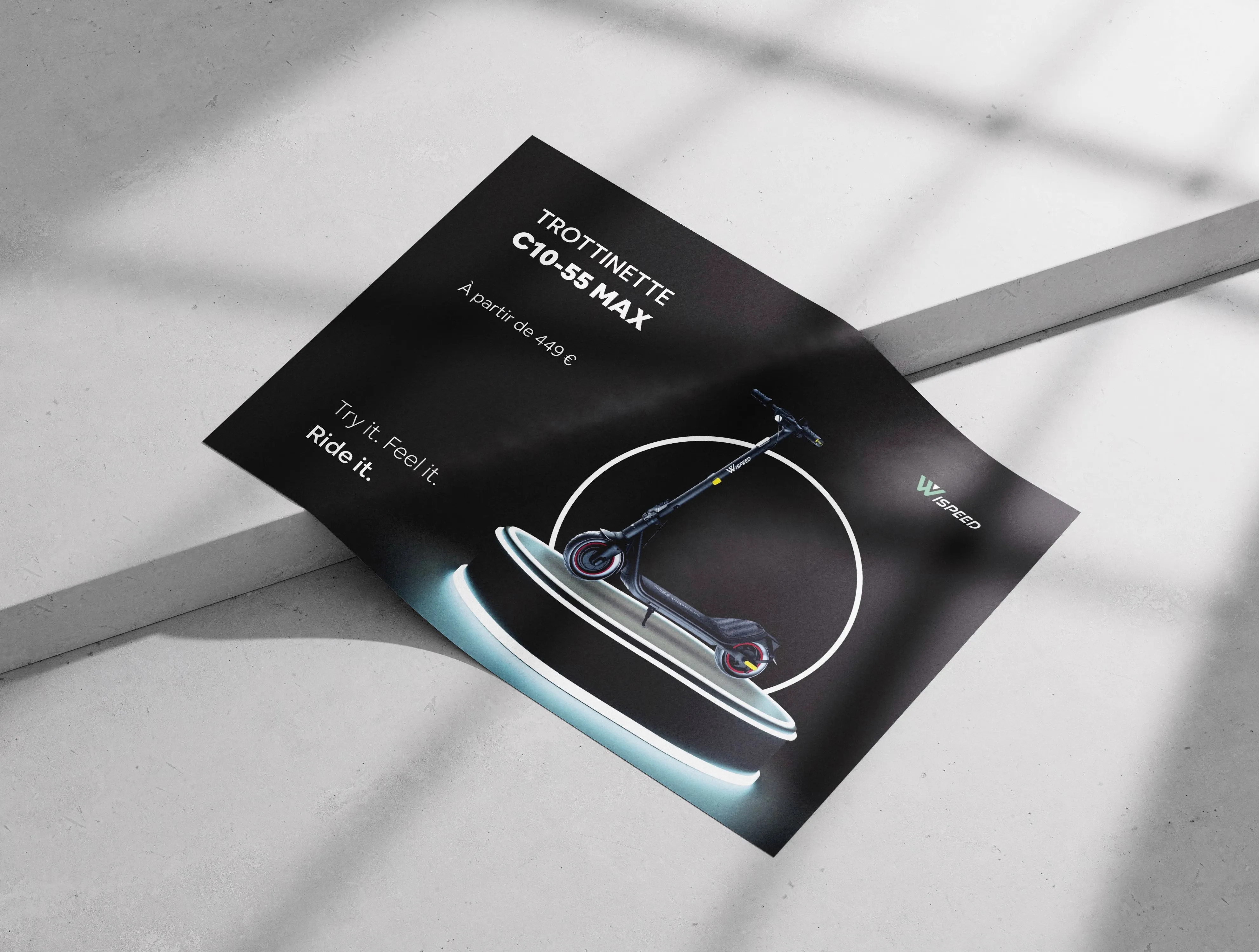
The brand suffered from a lack of communication and needed assistance to create a new poster.
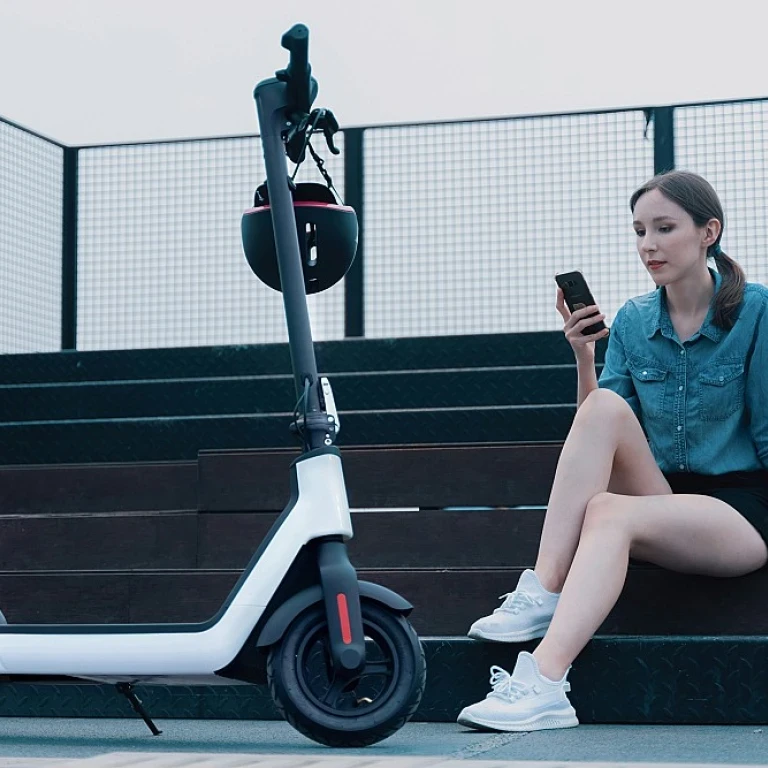
Source: www.ma-trottinette-electrique.com

Source: www.ma-trottinette-electrique.com

The Challenge

The existing identity lacked: ∙ consistency across platforms, ∙ strong visual recognition, ∙ scalable foundations, ∙ alignment between product and communication.

The Design Approach

The redesign focused on: ∙ redefining the visual language, ∙ improving digital consistency, ∙ creating scalable brand guidelines, ∙ balancing usability and perception.

Moodboard

Logo

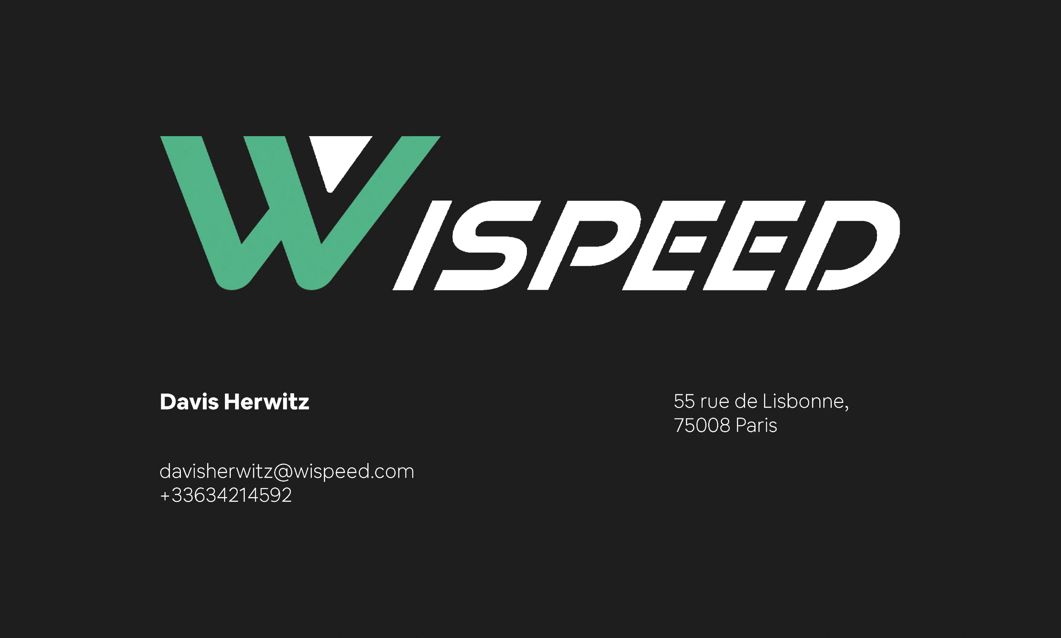
Back Card

Layout Strategy

General Color Palette

#FAFAFA

#4FB286

#1E5F74

#6E6E6A

#1D1D1A

Primary Color

#4FB286

Secondary Color

#1E5F74

Neutral Colors

#FAFAFA

#6E6E6A

#1D1D1A

General Typeface: Futura Medium

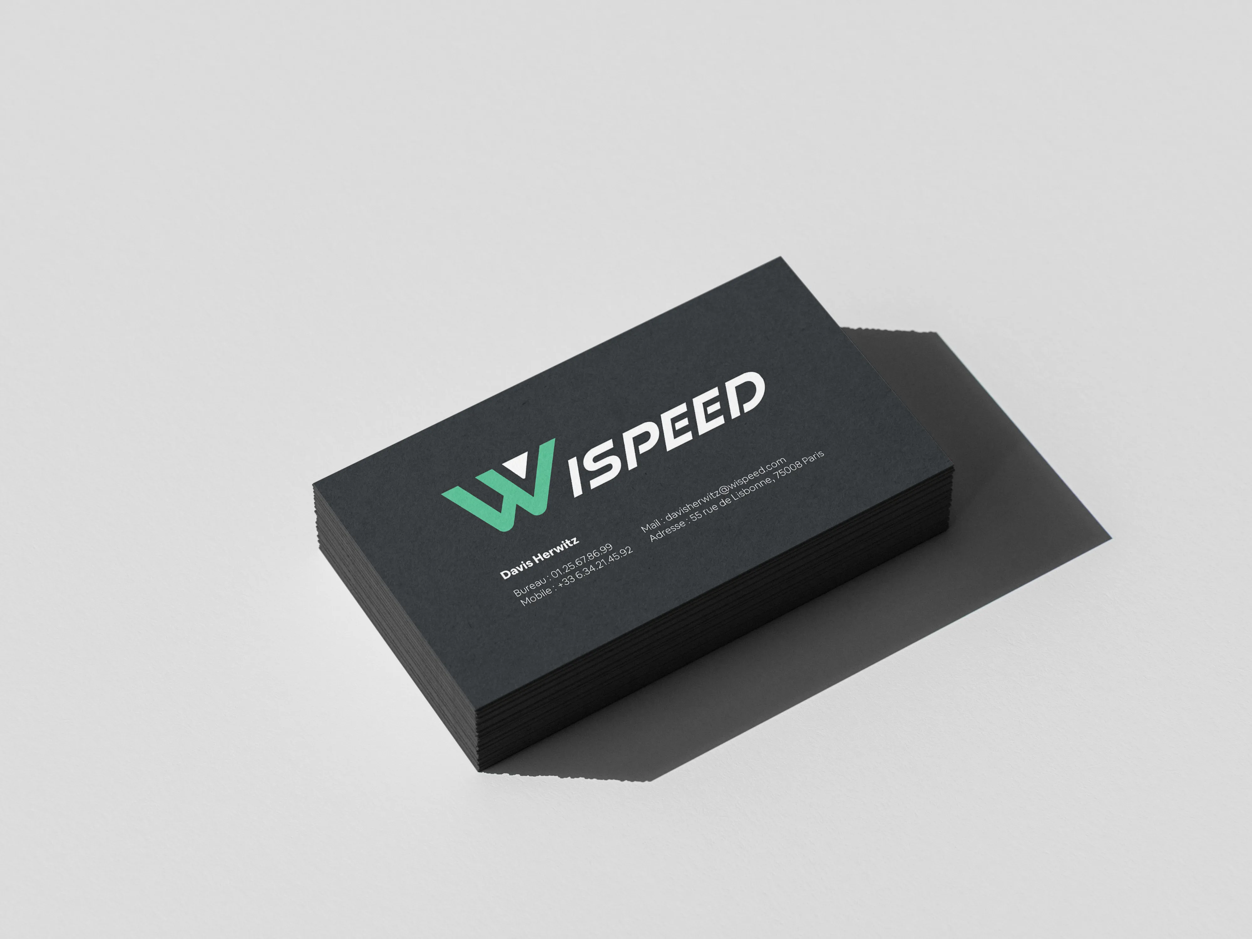
Front Card

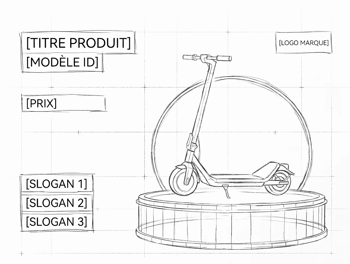
Layout Sketch

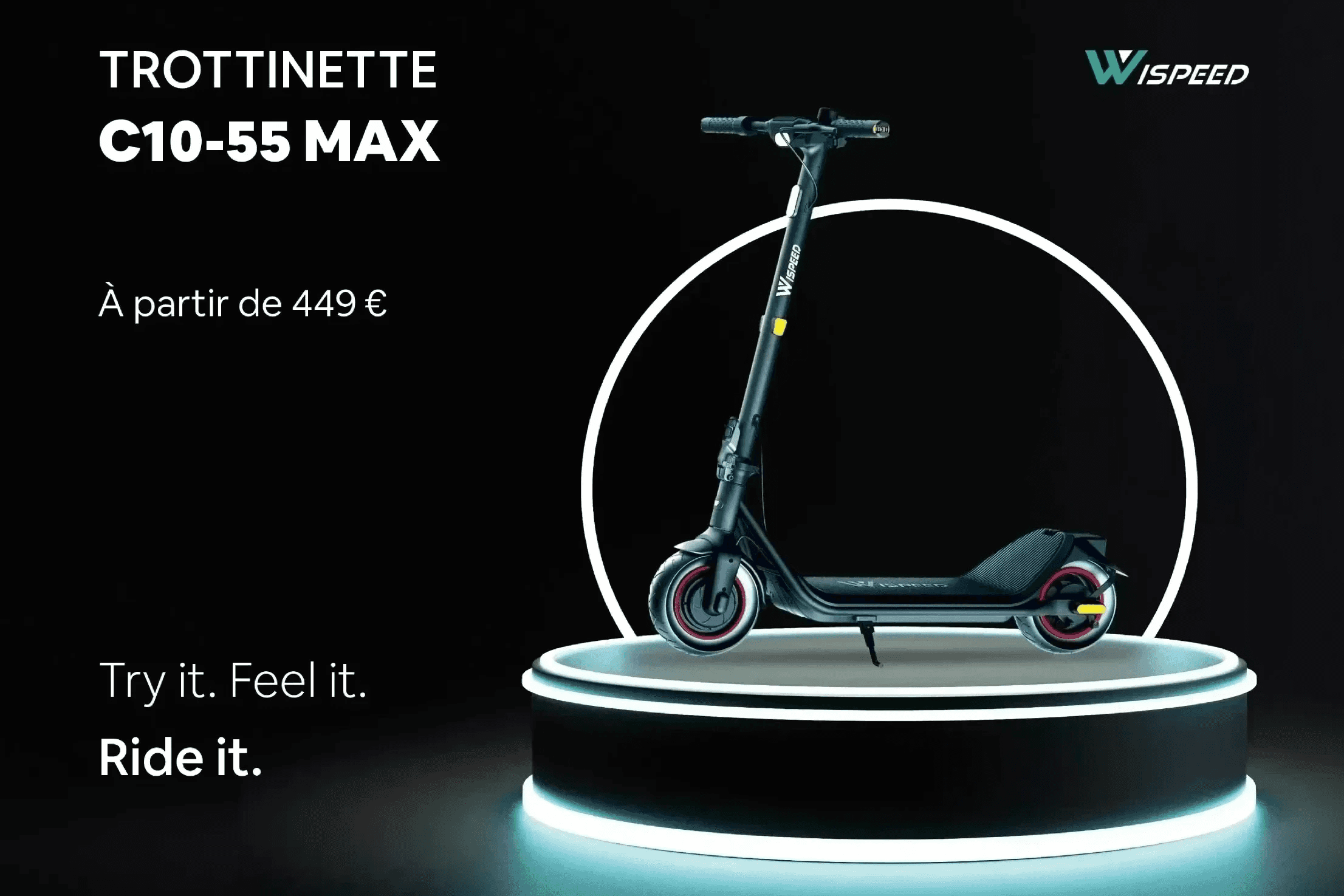
∙ Visual anchor: product isolated on a circular stage (right) to drive focus. ∙ Clear reading flow: name -> price -> key benefits stacked on the left. ∙ Grid system: structured layout for a clean, high-tech feel. ∙ Brand sign-off: logo placed top-right for quick identification.

The Design Approach

The redesign focused on: ∙ redefining the visual language, ∙ improving digital consistency, ∙ creating scalable brand guidelines, ∙ balancing usability and perception.

Moodboard

Back Card

Layout Strategy

Logo

General Color Palette

#FAFAFA

#6E6E6A

#4FB286

#1D1D1A

#1E5F74

Primary Color

#4FB286

Secondary Color

#1E5F74

Neutral Colors

#FAFAFA

#6E6E6A

#1D1D1A

Front Card

Layout Sketch

∙ Visual anchor: product isolated on a circular stage (right) to drive focus. ∙ Clear reading flow: name -> price -> key benefits stacked on the left. ∙ Grid system: structured layout for a clean, high-tech feel. ∙ Brand sign-off: logo placed top-right for quick identification.

General Typeface: Futura Medium

The Design Approach

The redesign focused on: ∙ redefining the visual language, ∙ improving digital consistency, ∙ creating scalable brand guidelines, ∙ balancing usability and perception.

General Color Palette

#FAFAFA

#6E6E6A

#4FB286

#1D1D1A

#1E5F74

Primary Color

#4FB286

Secondary Color

#1E5F74

Neutral Colors

#FAFAFA

#6E6E6A

#1D1D1A

Moodboard

General Typeface: Futura Medium

Logo

Front Card

Back Card

Layout Sketch

∙ Visual anchor: product isolated on a circular stage (right) to drive focus. ∙ Clear reading flow: name -> price -> key benefits stacked on the left. ∙ Grid system: structured layout for a clean, high-tech feel. ∙ Brand sign-off: logo placed top-right for quick identification.

Layout Strategy

The Solution

The new identity introduced: ∙ refreshed typography and colors, ∙ scalable digital assets, ∙ stronger visual coherence, ∙ more adaptable branding applications.

The Solution

The new identity introduced: ∙ refreshed typography and colors, ∙ scalable digital assets, ∙ stronger visual coherence, ∙ more adaptable branding applications.

The Outcome

The redesign improved brand consistency, recognition and scalability across digital experiences.

More Projects
Slide 1 of 1
Slide 1 of 1
Page 1 of 1

Graphics

Wispeed

A visual identity redesign created to strengthen brand recognition and improve consistency across digital touchpoints.

Graphics

Wispeed

A visual identity redesign created to strengthen brand recognition and improve consistency across digital touchpoints.

Metadata

•  Role: Graphic Designer

•  Timeline: 2 weeks

•  Tools: Illustrator, Photoshop

•  Deliverables: Visual Identity, Packaging, Poster

The Overview

A scalable digital brand system designed to modernize Wispeed’s visual identity and communication.

Source : https://wispeed.net/

Source : https://wispeed.net/

About The Brand

Urban micro-mobility company producing sleek, eco-friendly electric scooters for daily city commuters.

Actual Content

The brand suffered from a lack of communication and needed assistance to create a new poster.
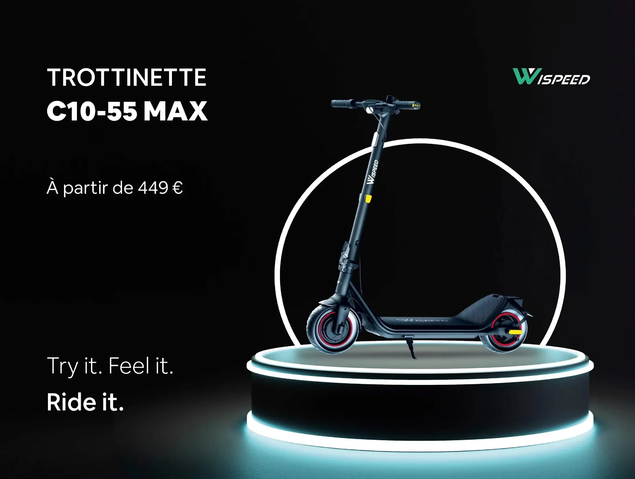
Source: www.ma-trottinette-electrique.com

Source: www.ma-trottinette-electrique.com

The Challenge

The existing identity lacked: ∙ consistency across platforms, ∙ strong visual recognition, ∙ scalable foundations, ∙ alignment between product and communication.

The Design Approach

The redesign focused on: ∙ redefining the visual language, ∙ improving digital consistency, ∙ creating scalable brand guidelines, ∙ balancing usability and perception.

Moodboard

Logo

Back Card

Layout Strategy

General Color Palette

#FAFAFA

#4FB286

#1E5F74

#6E6E6A

#1D1D1A

Primary Color

#4FB286

Secondary Color

#1E5F74

Neutral Colors

#FAFAFA

#6E6E6A

#1D1D1A

General Typeface: Futura Medium

Front Card

Layout Sketch

∙ Visual anchor: product isolated on a circular stage (right) to drive focus. ∙ Clear reading flow: name -> price -> key benefits stacked on the left. ∙ Grid system: structured layout for a clean, high-tech feel. ∙ Brand sign-off: logo placed top-right for quick identification.

The Design Approach

The redesign focused on: ∙ redefining the visual language, ∙ improving digital consistency, ∙ creating scalable brand guidelines, ∙ balancing usability and perception.

Moodboard

Back Card

Layout Strategy

Logo

General Color Palette

#FAFAFA

#6E6E6A

#4FB286

#1D1D1A

#1E5F74

Primary Color

#4FB286

Secondary Color

#1E5F74

Neutral Colors

#FAFAFA

#6E6E6A

#1D1D1A

Front Card

Layout Sketch

∙ Visual anchor: product isolated on a circular stage (right) to drive focus. ∙ Clear reading flow: name -> price -> key benefits stacked on the left. ∙ Grid system: structured layout for a clean, high-tech feel. ∙ Brand sign-off: logo placed top-right for quick identification.

General Typeface: Futura Medium

The Design Approach

The redesign focused on: ∙ redefining the visual language, ∙ improving digital consistency, ∙ creating scalable brand guidelines, ∙ balancing usability and perception.

General Color Palette

#FAFAFA

#6E6E6A

#4FB286

#1D1D1A

#1E5F74

Primary Color

#4FB286

Secondary Color

#1E5F74

Neutral Colors

#FAFAFA

#6E6E6A

#1D1D1A

Moodboard

General Typeface: Futura Medium

Logo

Front Card

Back Card

Layout Sketch

∙ Visual anchor: product isolated on a circular stage (right) to drive focus. ∙ Clear reading flow: name -> price -> key benefits stacked on the left. ∙ Grid system: structured layout for a clean, high-tech feel. ∙ Brand sign-off: logo placed top-right for quick identification.

Layout Strategy

The Solution

The new identity introduced: ∙ refreshed typography and colors, ∙ scalable digital assets, ∙ stronger visual coherence, ∙ more adaptable branding applications.

The Solution

The new identity introduced: ∙ refreshed typography and colors, ∙ scalable digital assets, ∙ stronger visual coherence, ∙ more adaptable branding applications.

The Outcome

The redesign improved brand consistency, recognition and scalability across digital experiences.

More Projects
Slide 1 of 1
Slide 1 of 1
Page 1 of 1