Graphics

Culture Pub

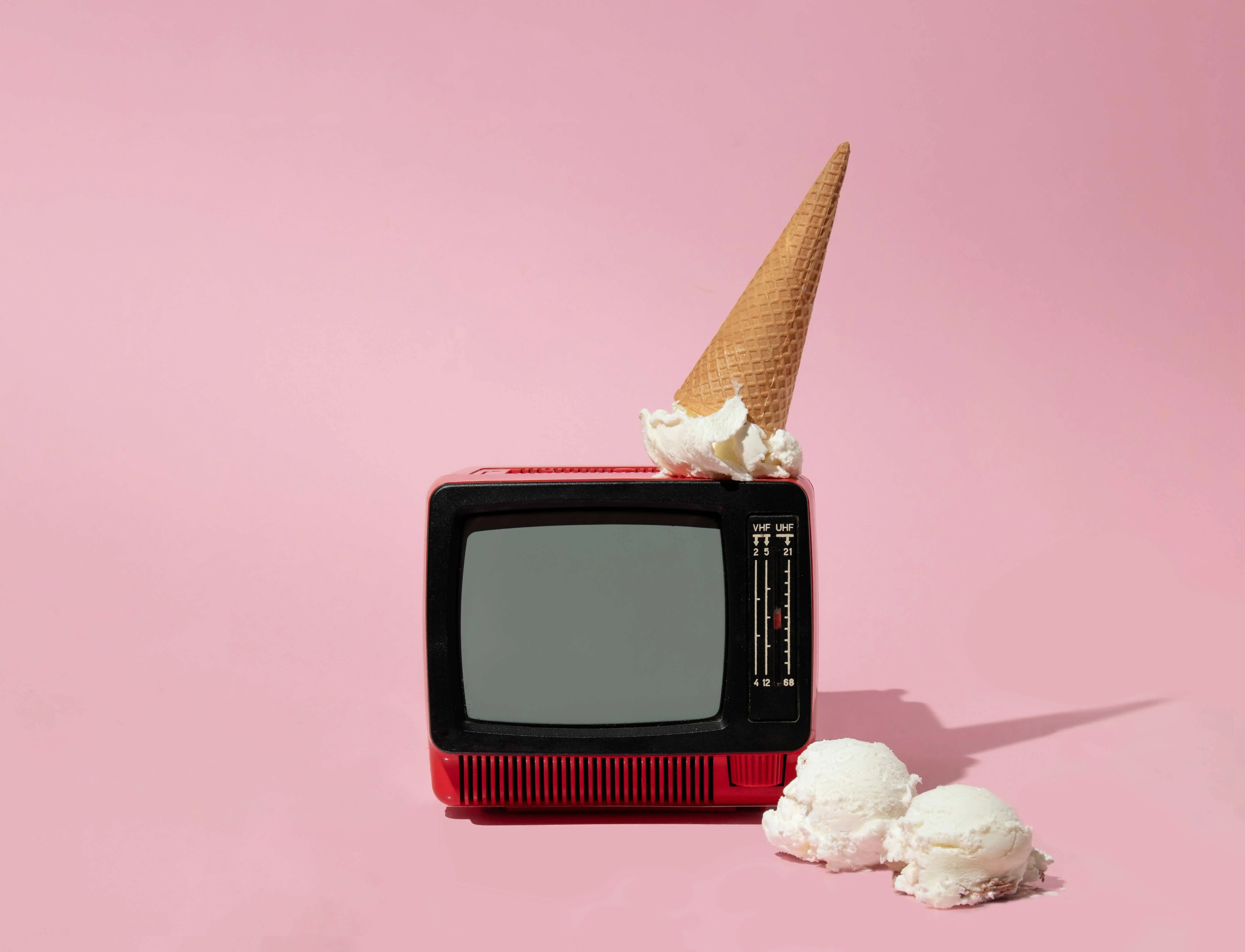
Complete web redesign, full rebranding, and creation of a new weekly print magazine format for the iconic pop-culture platform.

Graphics

Culture Pub

Complete web redesign, full rebranding, and creation of a new weekly print magazine format for the iconic pop-culture platform.

Metadata

•  Role: Lead UI/UX & Graphic Designer

•  Timeline: 3 weeks

•  Tools: Illustrator, Photoshop, InDesign, Figma, Github, Vercel

•  Deliverables: Editorial Brand, Web Redesign, Weekly Magazine Layout, Content Architecture, Responsive Views

The Overview

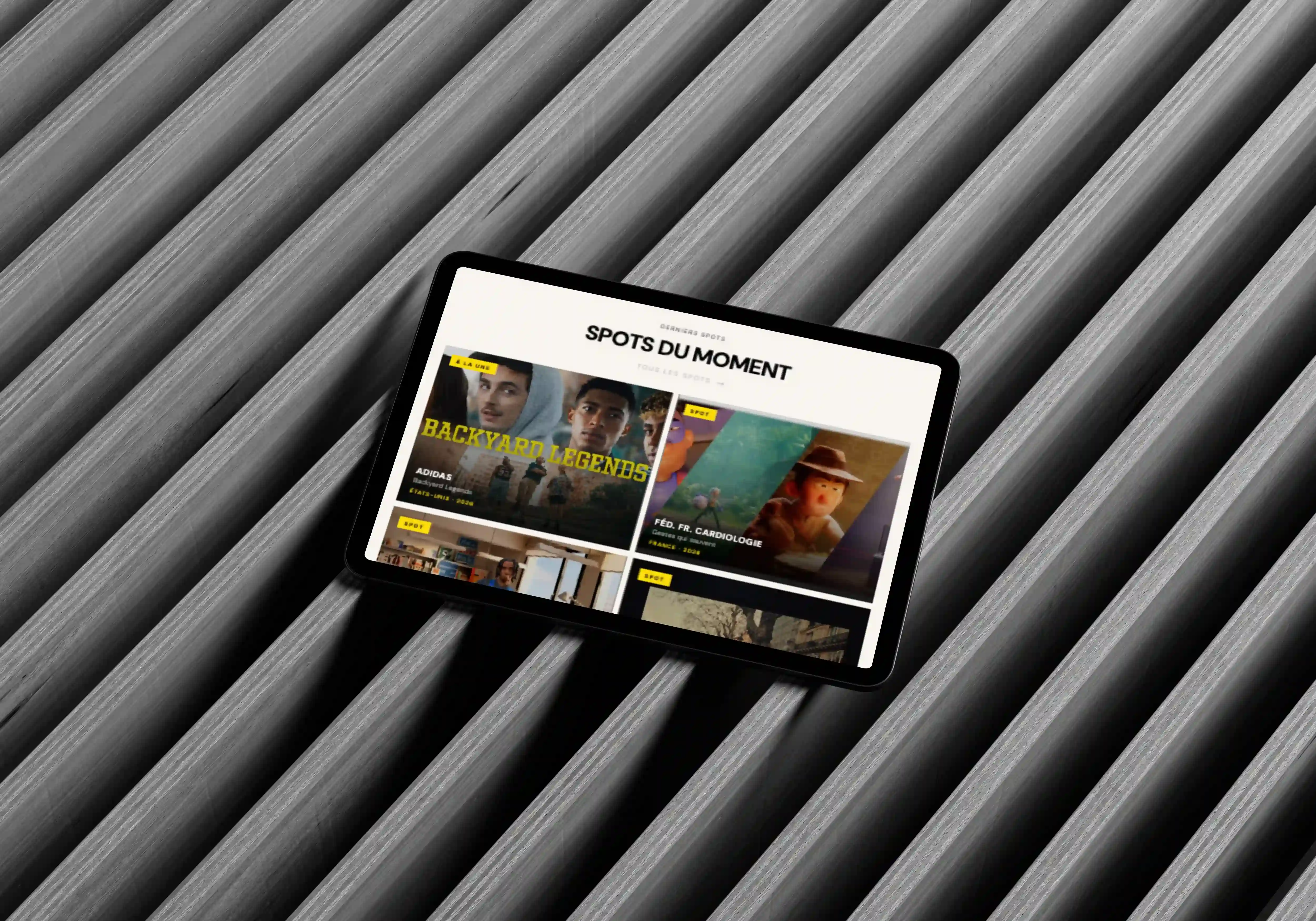
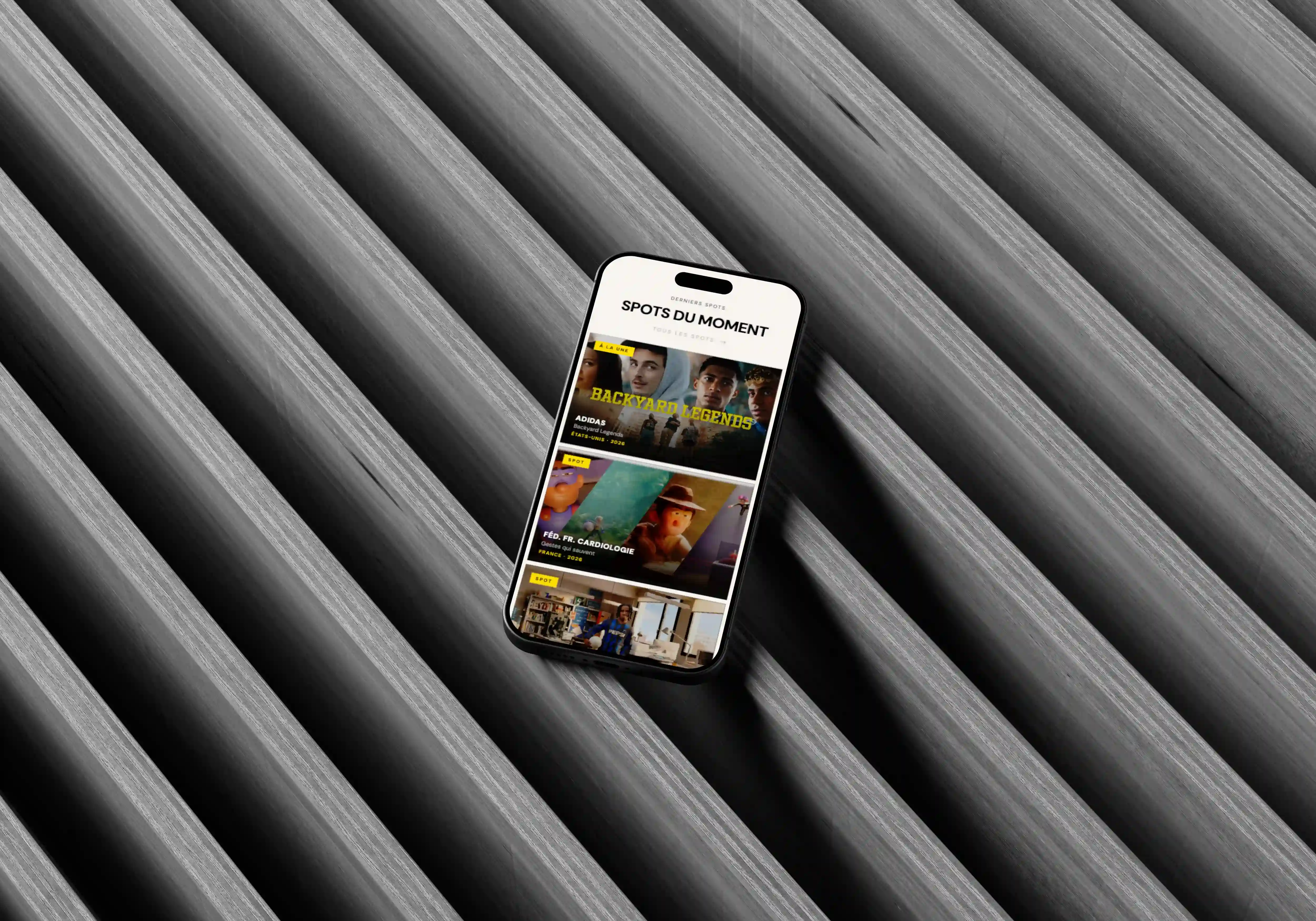
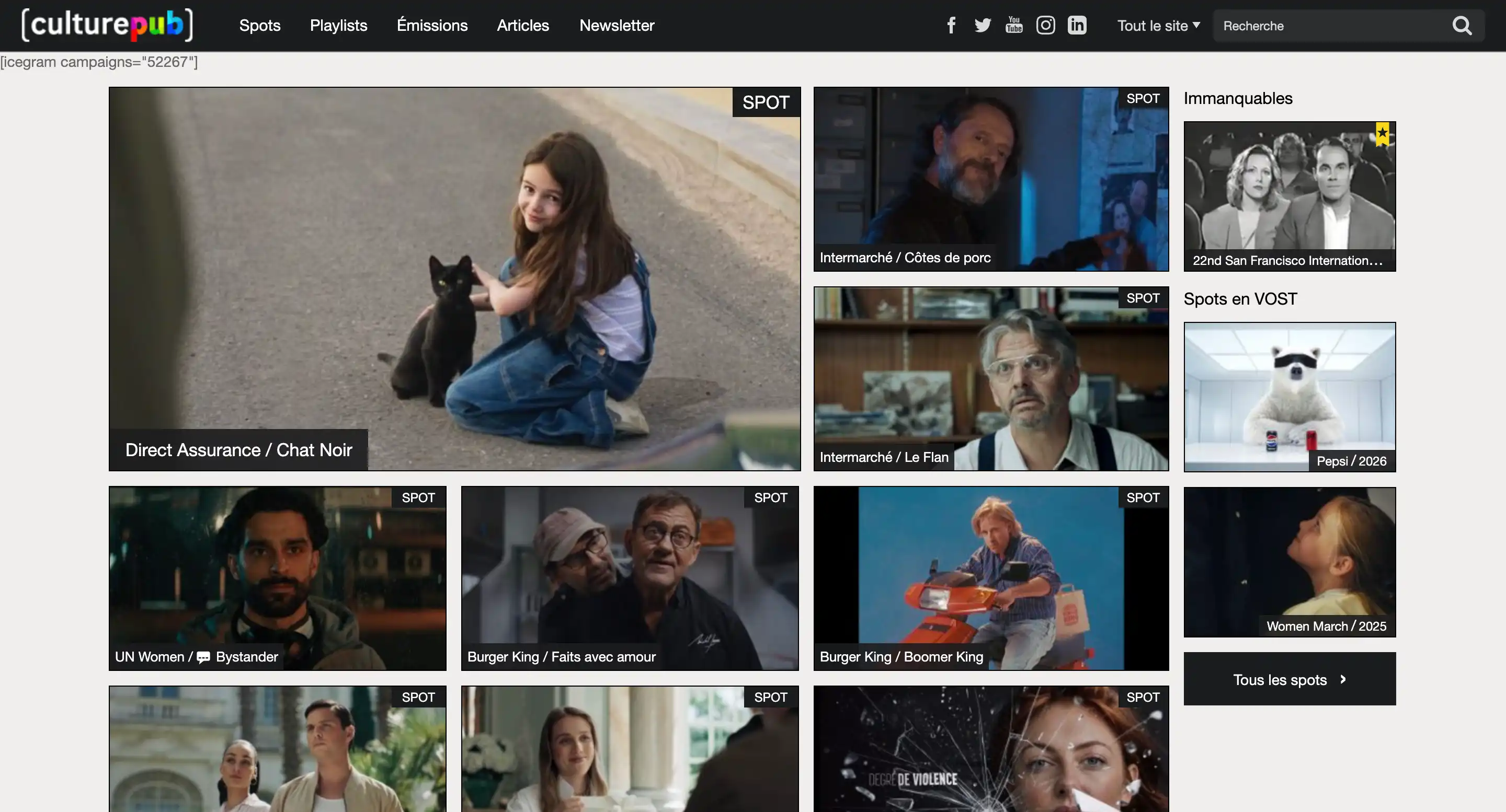
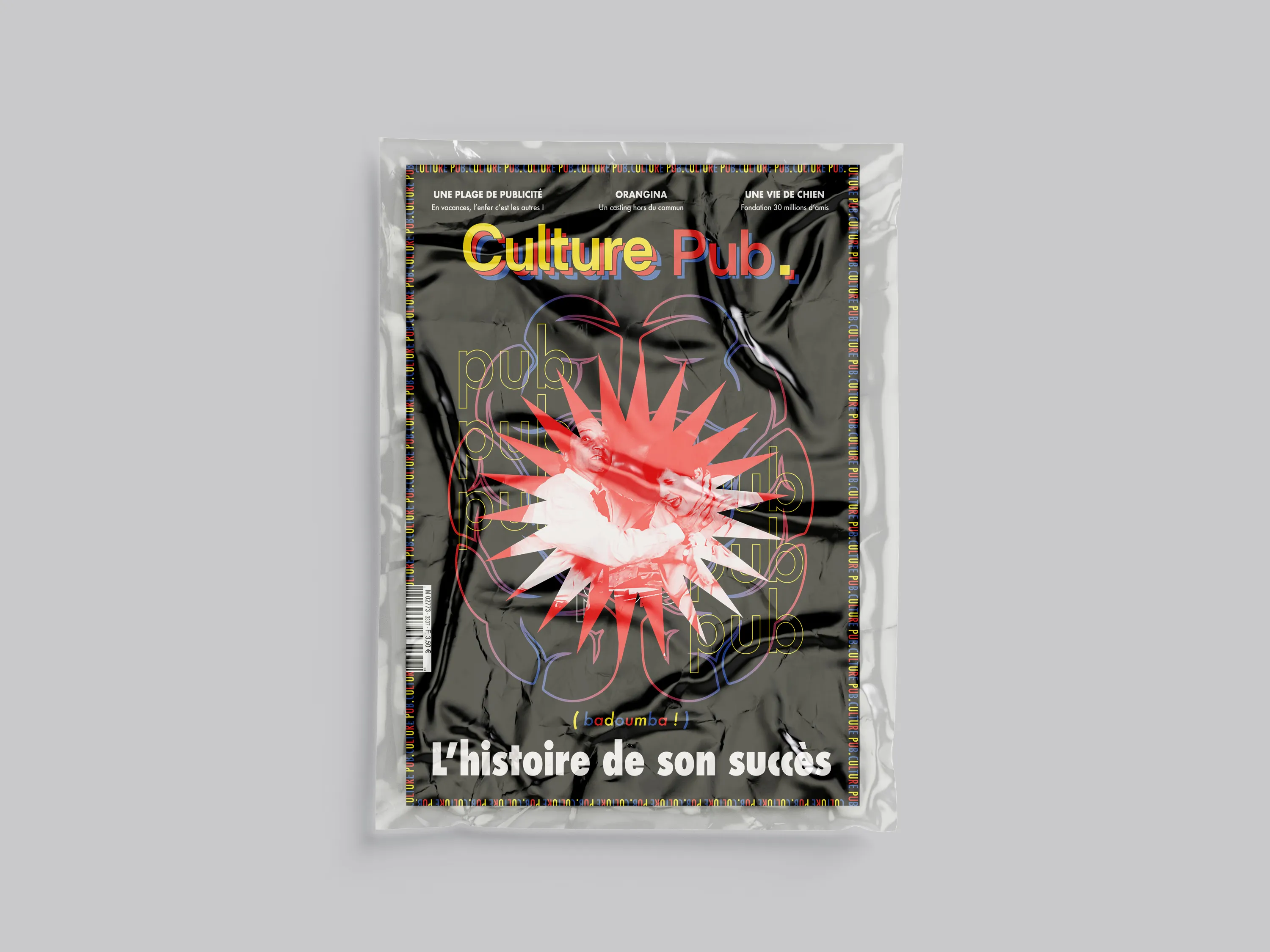
Culture Pub is an iconic pop-culture platform dedicated to global advertising trends. This project delivers a complete rebranding, modernizing the web experience and introducing a new weekly print magazine format.

About The Brand

Iconic pop-culture platform highlighting worldwide advertising trends, creative archives, and media history.

Actual Content

The legacy site suffered from a cluttered layout, poor video discovery, and an outdated visual hierarchy across both digital platforms and publication media.
The Challenge

The project aimed to: ∙ increase brand memorability, ∙ stand out visually, ∙ create emotional engagement, ∙ maintain scalable branding.


The Design Approach

The creative direction focused on: ∙ UX audit of the legacy platform, sitemap restructuring, and information architecture mapping. ∙ Wireframing key user flows (Home, Video Detail, Archives) and establishing a new print layout grid for the magazine. ∙ Editorial moodboard exploration, typography pairing, and visual benchmarks for the complete rebranding.

Moodbaard

Secondary Typeface: Futura Medium

Logo CMYK (Magazine)

Magazine (Table of Contents)

Magazine

General Color Palette

#FBF9F5

#FFDB0F

#E12722

#2C4E98

#252525

Primary Colors

#FFDB0F

#E12722

Secondary Color

#2C4E98

Neutral Colors

#FBF9F5

#252525

Primary Typeface: Britanica Black

Logo RGB (Website)

Magazine (Front Cover)

Magazine

Magazine

The Design Approach

The creative direction focused on: ∙ UX audit of the legacy platform, sitemap restructuring, and information architecture mapping. ∙ Wireframing key user flows (Home, Video Detail, Archives) and establishing a new print layout grid for the magazine. ∙ Editorial moodboard exploration, typography pairing, and visual benchmarks for the complete rebranding.

Moodbaard

Logo CMYK (Magazine)

Magazine (Table of Contents)

Magazine

Primary Typeface: Britanica Black

General Color Palette

#FBF9F5

#2C4E98

#FFDB0F

#252525

#E12722

Primary Colors

#FFDB0F

#E12722

Secondary Color

#2C4E98

Neutral Colors

#FBF9F5

#252525

Logo RGB (Website)

Magazine (Front Cover)

Magazine

Magazine

Secondary Typeface: Futura Medium

The Design Approach

The creative direction focused on: ∙ UX audit of the legacy platform, sitemap restructuring, and information architecture mapping. ∙ Wireframing key user flows (Home, Video Detail, Archives) and establishing a new print layout grid for the magazine. ∙ Editorial moodboard exploration, typography pairing, and visual benchmarks for the complete rebranding.

General Color Palette

#FBF9F5

#2C4E98

#FFDB0F

#252525

#E12722

Primary Colors

#FFDB0F

#E12722

Secondary Color

#2C4E98

Neutral Colors

#FBF9F5

#252525

Moodbaard

Primary Typeface: Britanica Black

Secondary Typeface: Futura Medium

Logo RGB (Website)

Logo CMYK (Magazine)

Magazine (Front Cover)

Magazine (Table of Contents)

Magazine

Magazine

Magazine

The Solution

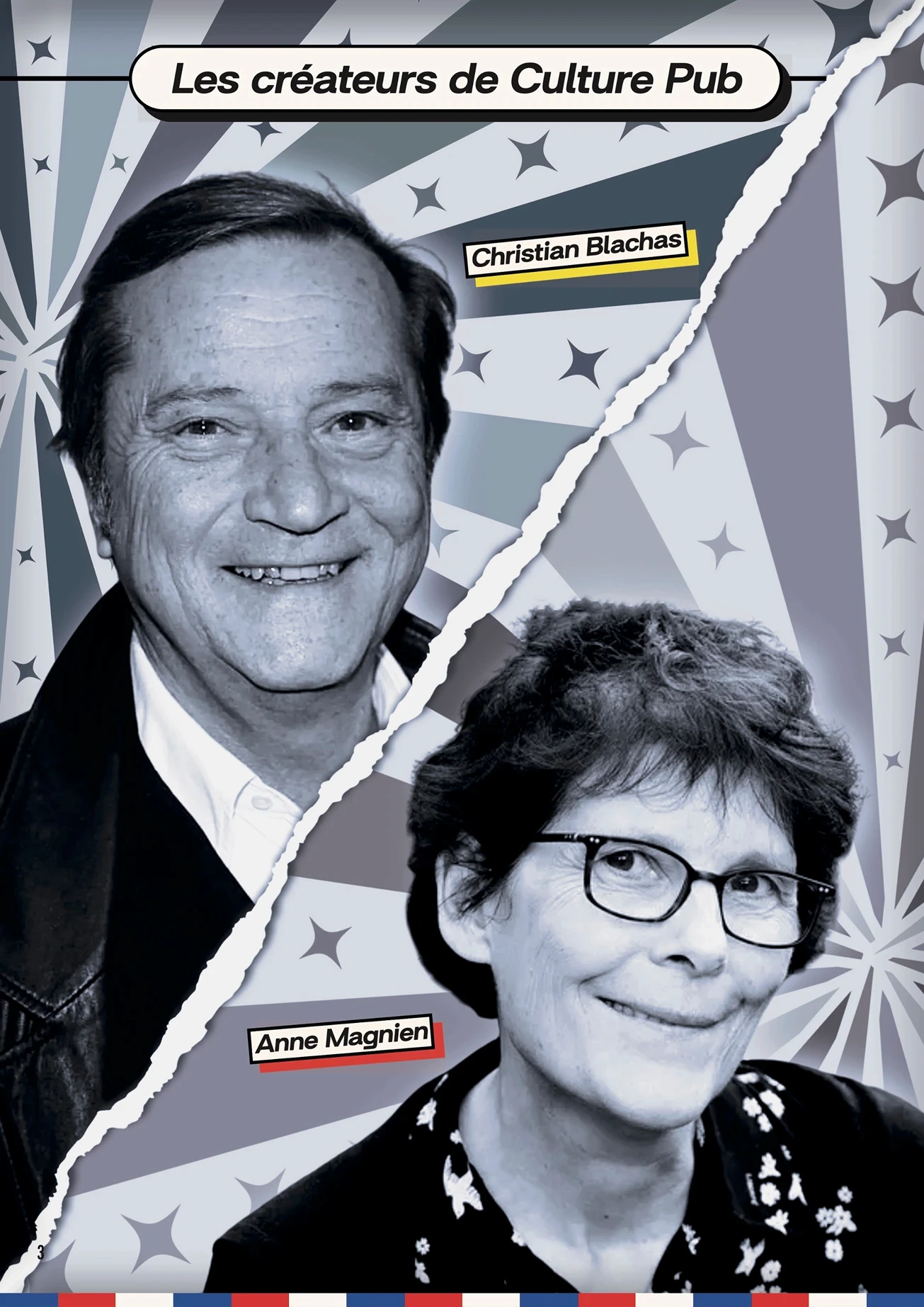
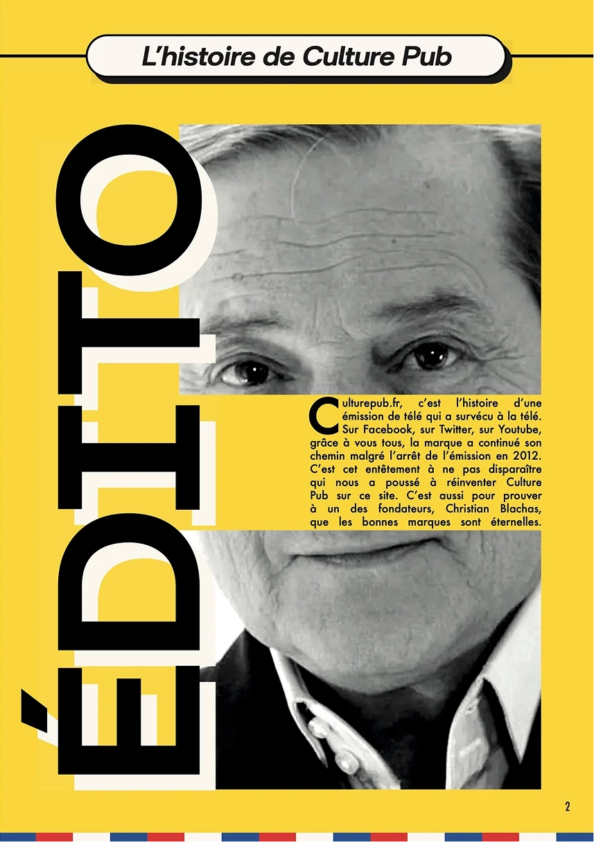
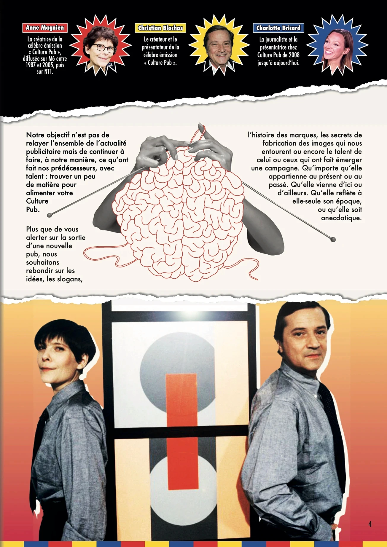
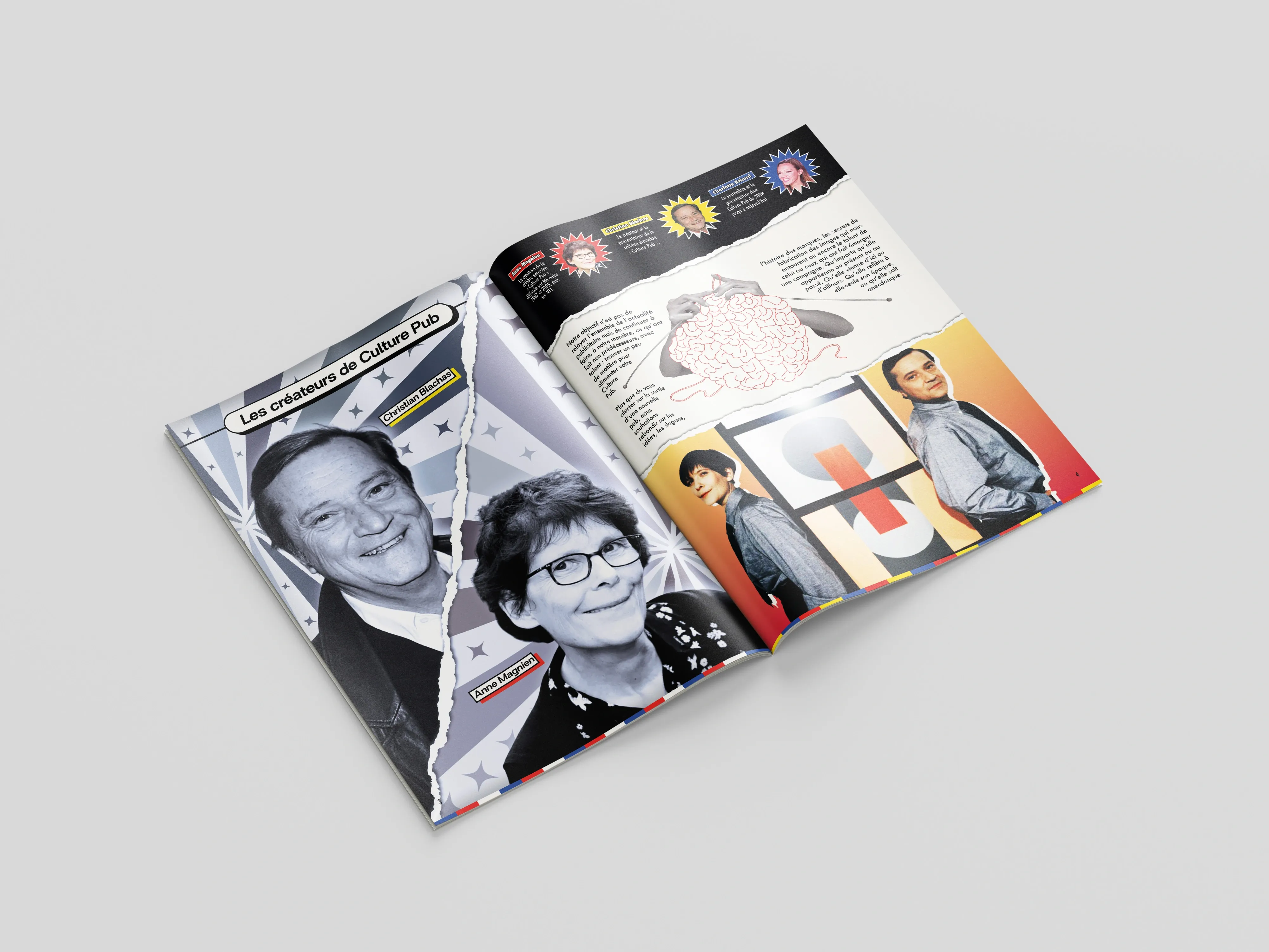
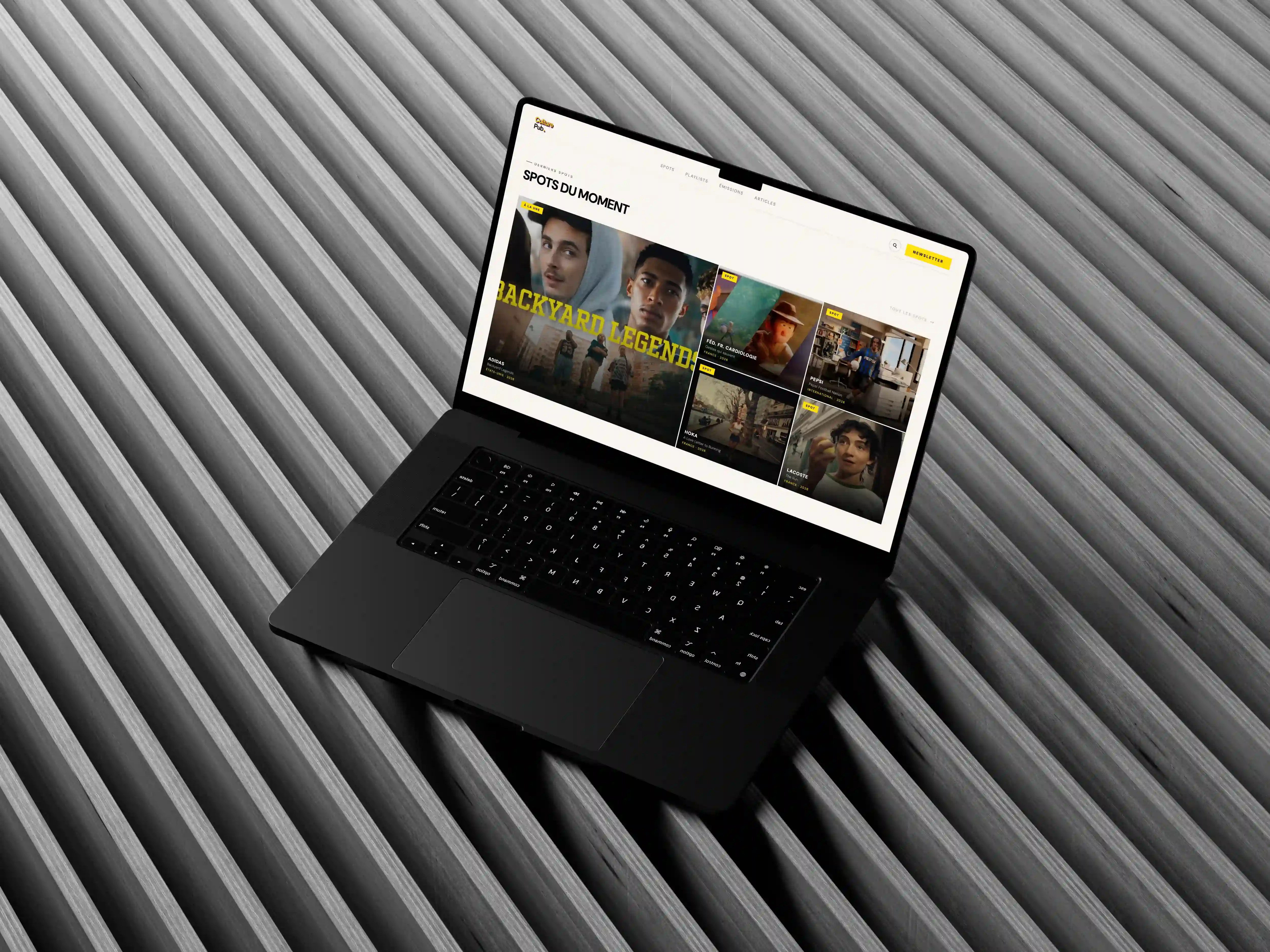
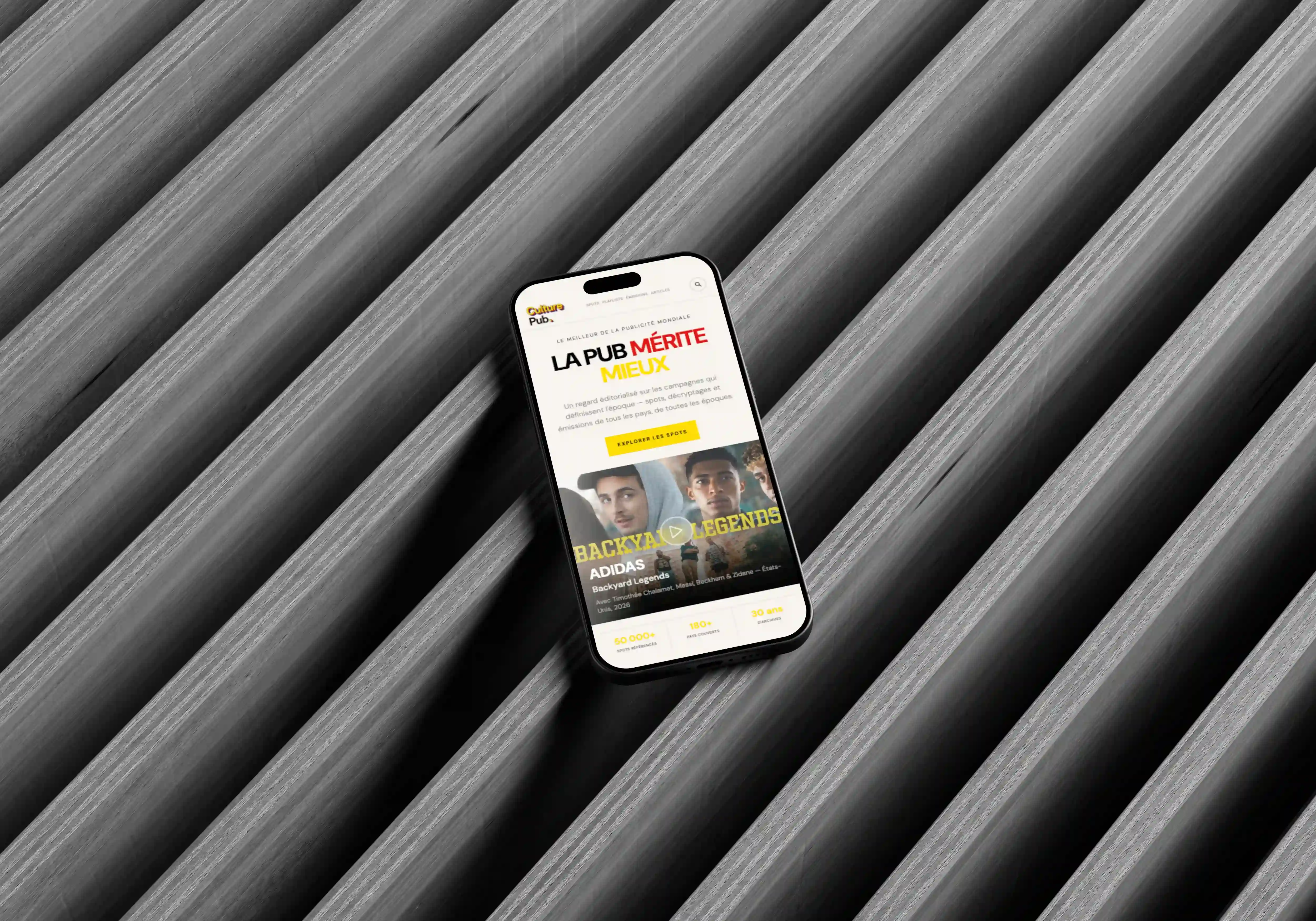
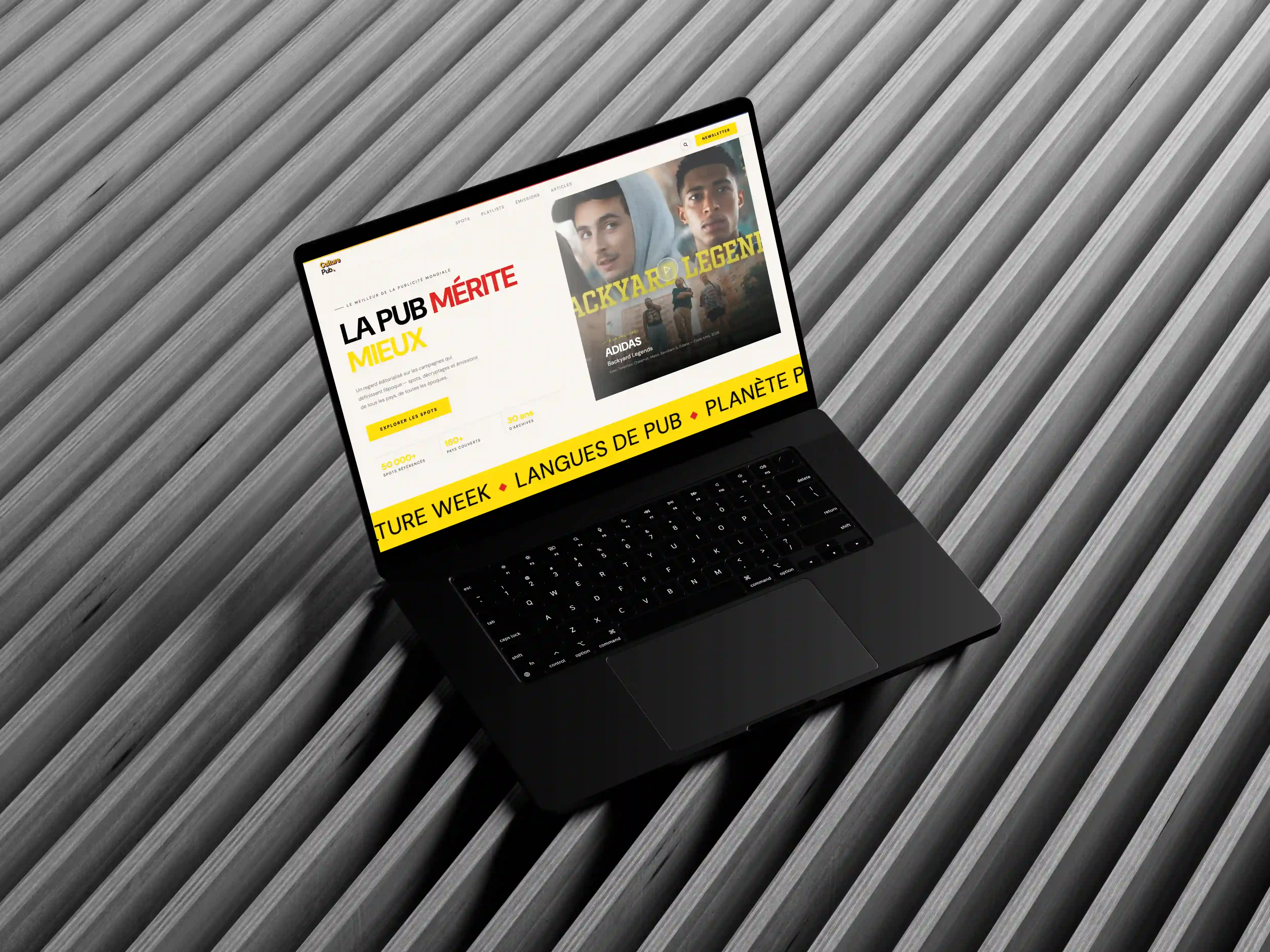
∙ Clean interface with a flexible grid, optimized video player, and restructured archive filters. ∙ A brand-new editorial print layout featuring a bold front cover, structured contents page, and impactful article double-page spreads. ∙ Unified typography and assets ensuring a seamless cross-media transition between web browsing and magazine reading.

The Solution

∙ Clean interface with a flexible grid, optimized video player, and restructured archive filters. ∙ A brand-new editorial print layout featuring a bold front cover, structured contents page, and impactful article double-page spreads. ∙ Unified typography and assets ensuring a seamless cross-media transition between web browsing and magazine reading.

The Outcome

Delivered a cohesive, high-impact media ecosystem that elevates video browsing and introduces an engaging weekly magazine format, driving stronger user retention and content discovery.

More Projects
Slide 1 of 1
Slide 1 of 1
Page 1 of 1

Graphics

Culture Pub

Complete web redesign, full rebranding, and creation of a new weekly print magazine format for the iconic pop-culture platform.

Graphics

Culture Pub

Complete web redesign, full rebranding, and creation of a new weekly print magazine format for the iconic pop-culture platform.

Metadata

•  Role: Lead UI/UX & Graphic Designer

•  Timeline: 3 weeks

•  Tools: Illustrator, Photoshop, InDesign, Figma, Github, Vercel

•  Deliverables: Editorial Brand, Web Redesign, Weekly Magazine Layout, Content Architecture, Responsive Views

The Overview

Culture Pub is an iconic pop-culture platform dedicated to global advertising trends. This project delivers a complete rebranding, modernizing the web experience and introducing a new weekly print magazine format.

About The Brand

Iconic pop-culture platform highlighting worldwide advertising trends, creative archives, and media history.

Actual Content

The legacy site suffered from a cluttered layout, poor video discovery, and an outdated visual hierarchy across both digital platforms and publication media.

The Challenge

The project aimed to: ∙ increase brand memorability, ∙ stand out visually, ∙ create emotional engagement, ∙ maintain scalable branding.

The Design Approach

The creative direction focused on: ∙ UX audit of the legacy platform, sitemap restructuring, and information architecture mapping. ∙ Wireframing key user flows (Home, Video Detail, Archives) and establishing a new print layout grid for the magazine. ∙ Editorial moodboard exploration, typography pairing, and visual benchmarks for the complete rebranding.

Moodbaard

Secondary Typeface: Futura Medium

Logo CMYK (Magazine)

Magazine (Table of Contents)

Magazine

General Color Palette

#FBF9F5

#FFDB0F

#E12722

#2C4E98

#252525

Primary Colors

#FFDB0F

#E12722

Secondary Color

#2C4E98

Neutral Colors

#FBF9F5

#252525

Primary Typeface: Britanica Black

Logo RGB (Website)

Magazine (Front Cover)

Magazine

Magazine

The Design Approach

The creative direction focused on: ∙ UX audit of the legacy platform, sitemap restructuring, and information architecture mapping. ∙ Wireframing key user flows (Home, Video Detail, Archives) and establishing a new print layout grid for the magazine. ∙ Editorial moodboard exploration, typography pairing, and visual benchmarks for the complete rebranding.

Moodbaard

Logo CMYK (Magazine)

Magazine (Table of Contents)

Magazine

Primary Typeface: Britanica Black

General Color Palette

#FBF9F5

#2C4E98

#FFDB0F

#252525

#E12722

Primary Colors

#FFDB0F

#E12722

Secondary Color

#2C4E98

Neutral Colors

#FBF9F5

#252525

Logo RGB (Website)

Magazine (Front Cover)

Magazine

Magazine

Secondary Typeface: Futura Medium

The Design Approach

The creative direction focused on: ∙ UX audit of the legacy platform, sitemap restructuring, and information architecture mapping. ∙ Wireframing key user flows (Home, Video Detail, Archives) and establishing a new print layout grid for the magazine. ∙ Editorial moodboard exploration, typography pairing, and visual benchmarks for the complete rebranding.

General Color Palette

#FBF9F5

#2C4E98

#FFDB0F

#252525

#E12722

Primary Colors

#FFDB0F

#E12722

Secondary Color

#2C4E98

Neutral Colors

#FBF9F5

#252525

Moodbaard

Primary Typeface: Britanica Black

Secondary Typeface: Futura Medium

Logo RGB (Website)

Logo CMYK (Magazine)

Magazine (Front Cover)

Magazine (Table of Contents)

Magazine

Magazine

Magazine

The Solution

∙ Clean interface with a flexible grid, optimized video player, and restructured archive filters. ∙ A brand-new editorial print layout featuring a bold front cover, structured contents page, and impactful article double-page spreads. ∙ Unified typography and assets ensuring a seamless cross-media transition between web browsing and magazine reading.

The Solution

∙ Clean interface with a flexible grid, optimized video player, and restructured archive filters. ∙ A brand-new editorial print layout featuring a bold front cover, structured contents page, and impactful article double-page spreads. ∙ Unified typography and assets ensuring a seamless cross-media transition between web browsing and magazine reading.

The Outcome

Delivered a cohesive, high-impact media ecosystem that elevates video browsing and introduces an engaging weekly magazine format, driving stronger user retention and content discovery.
More Projects
Slide 1 of 1
Slide 1 of 1
Page 1 of 1