Graphics

We Love Green

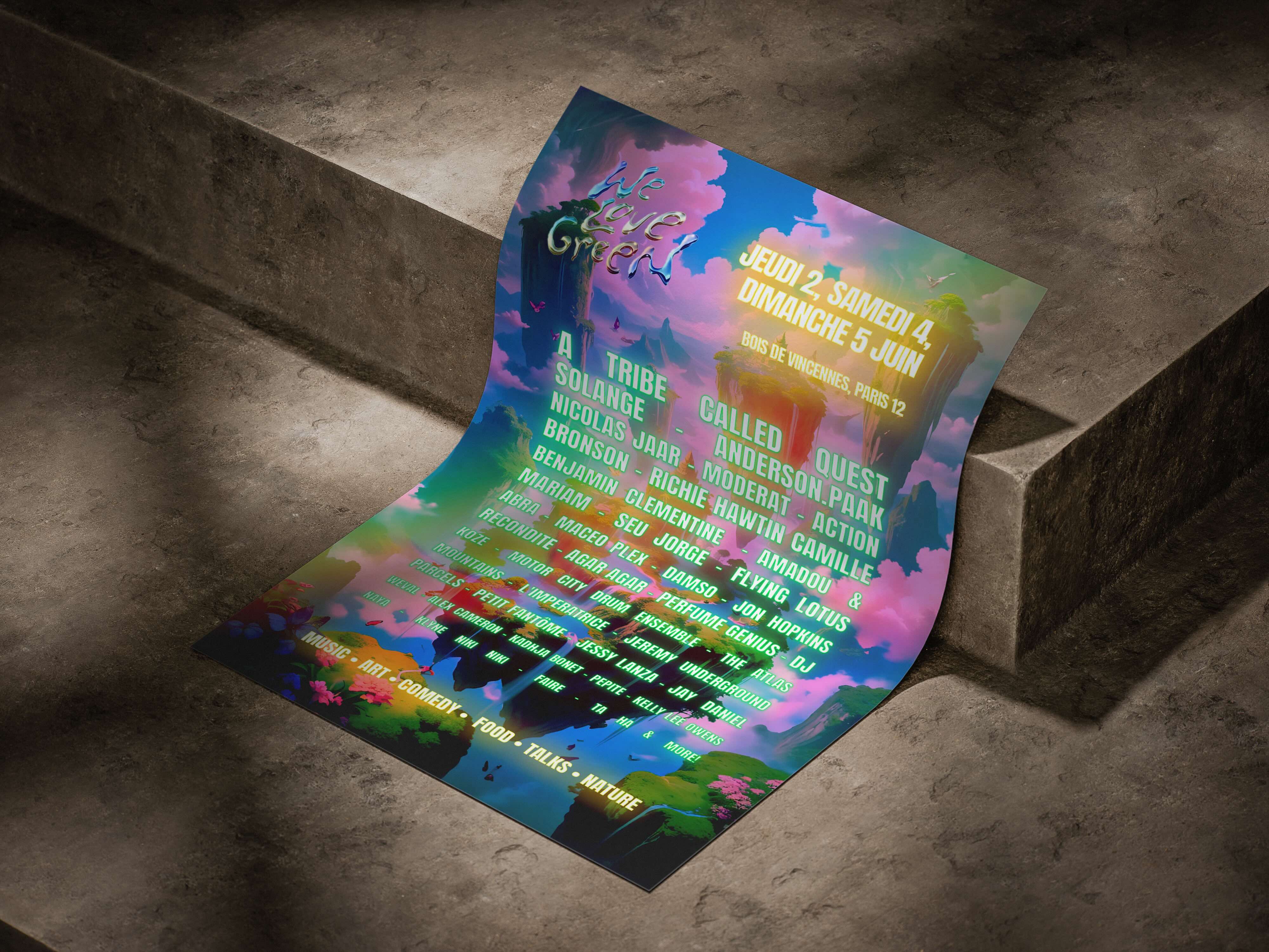
A poster concept combining editorial composition, typography and visual experimentation to reflect the festival’s contemporary identity.

Graphics

We Love Green

A poster concept combining editorial composition, typography and visual experimentation to reflect the festival’s contemporary identity.

Metadata

•  Role: Graphic Designer

•  Timeline: 1 week

•  Tool: Photoshop

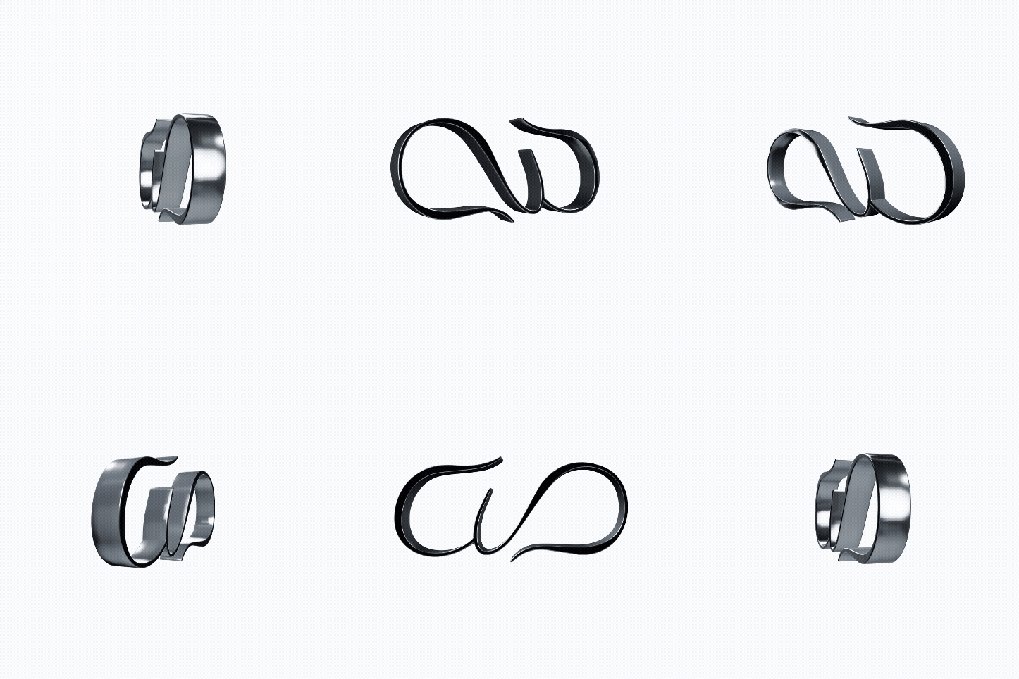
•  Deliverables: Key Visual, Keyring Assets, Event Key Visual, Print & Digital Layouts

The Overview

A visual concept designed to create a strong and memorable festival identity through expressive graphic storytelling.

Source : https://shotgun.live/fr/venues/we-love-green-festival/

Source : https://shotgun.live/fr/venues/we-love-green-festival/

About The Brand

Renowned eco-conscious music festival blending sustainability, art installations, and international live music.

Actual Content

The event needed a unifying key visual capable of conveying environmental commitment alongside music festival energy.
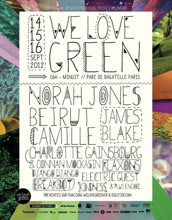
Old Style Poster (Source : www.pinterest.com)

Old Style Poster (Source : www.pinterest.com)

The Challenge

The objective was to: ∙ capture attention quickly, ∙ reflect the festival atmosphere, ∙ balance information and aesthetics, ∙ create strong visual memorability.
The Design Approach

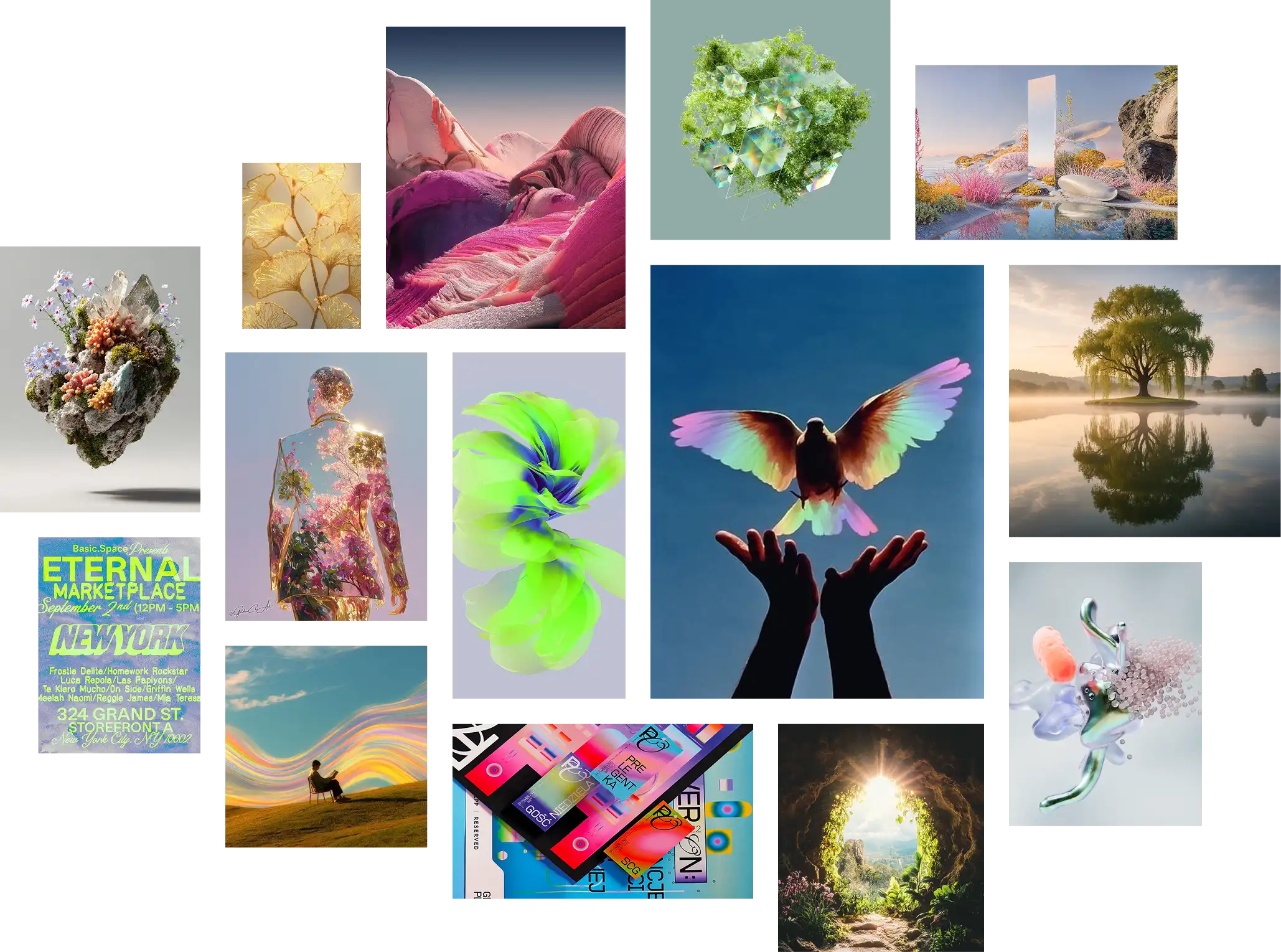
The creative direction focused on: ∙ expressive typography, ∙ bold composition, ∙ editorial-inspired layouts, ∙ visual rhythm and experimentation.

Moodboard

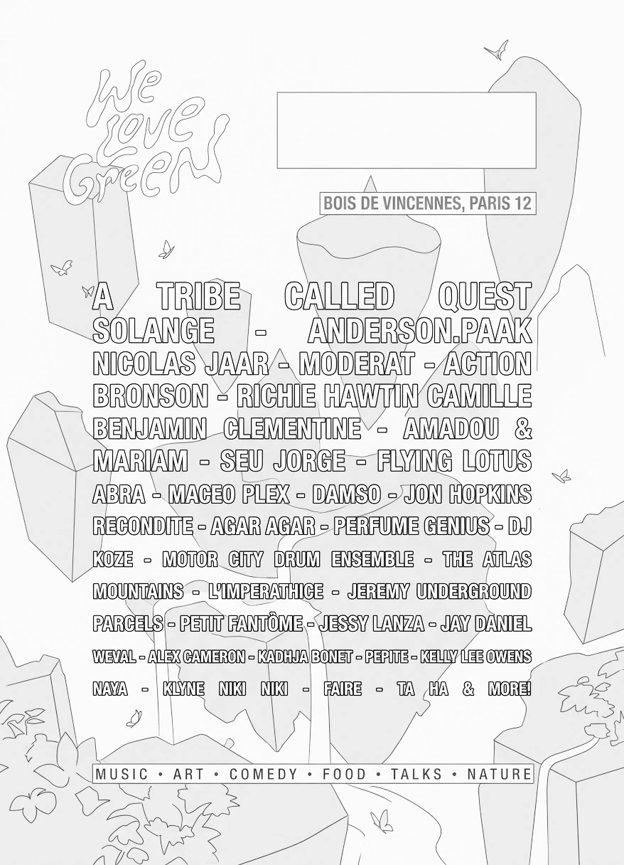
Poster Layout

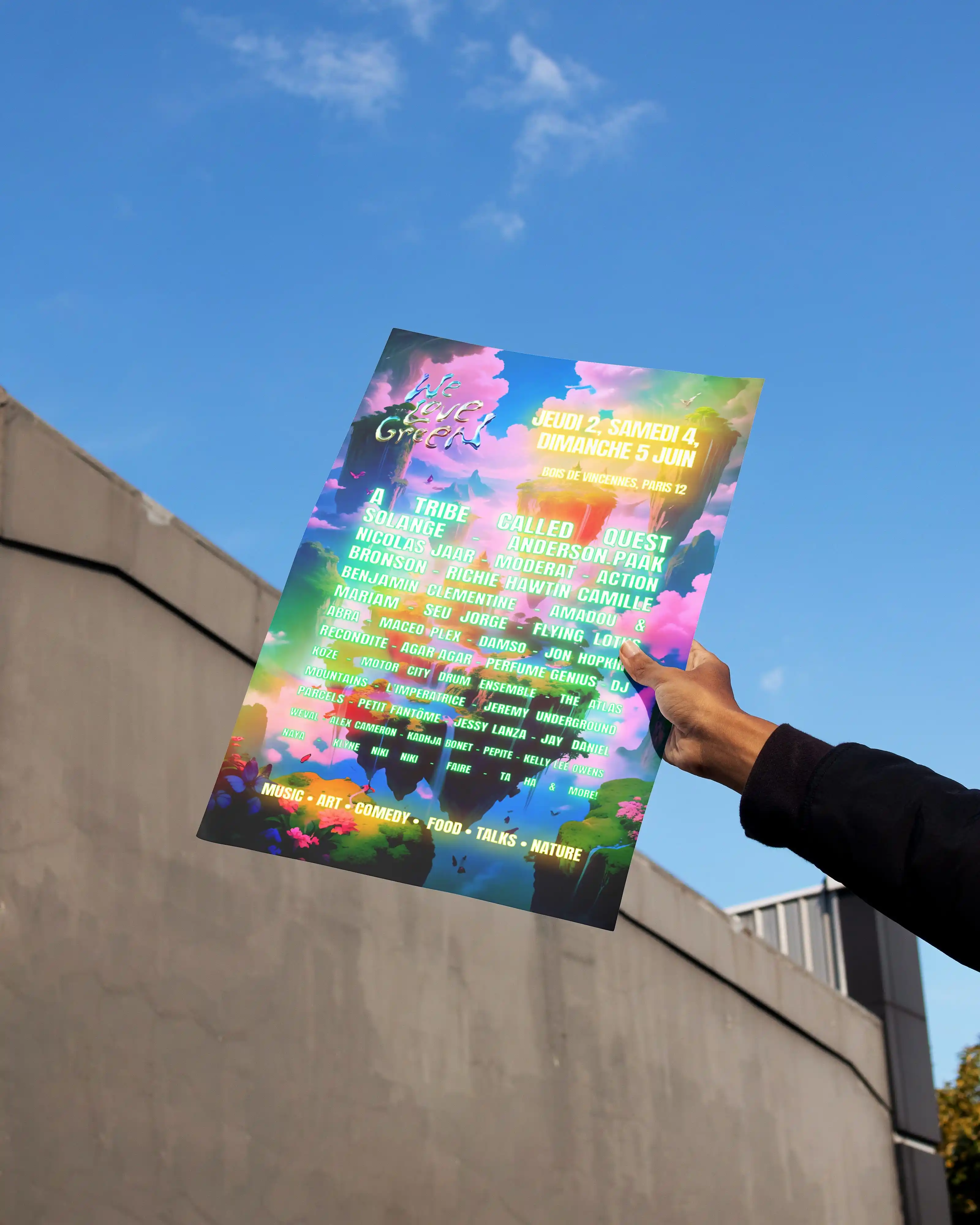
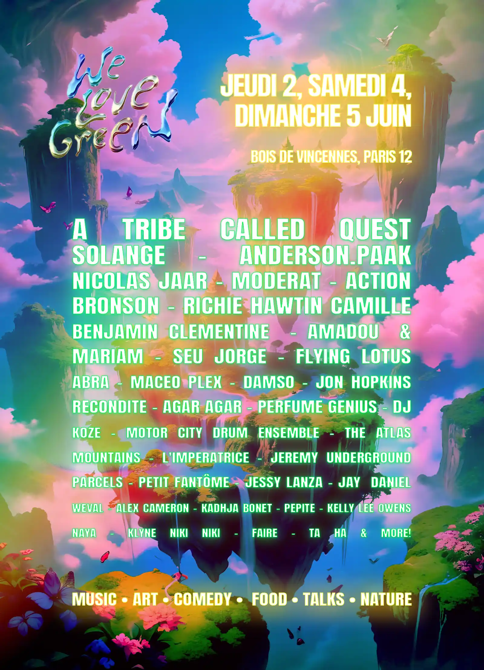
∙ Visual anchor: hand-drawn festival logo (top-left) contrasting with bold block typography for the line-up. ∙ Clear reading flow: logo → date box → venue → line-up → category tags, stacked top to bottom. ∙ Grid system: illustrated background shapes structure the page for a distinctive, editorial feel. ∙ Footer sign-off: category tags placed at the bottom for quick content identification.

General Color Palette

#F3C64D

#E98BC8

#F25A28

#6CFF9E

#2E6FA8

General Typeface: Anton Regular

Final Poster

The Design Approach

The creative direction focused on: ∙ expressive typography, ∙ bold composition, ∙ editorial-inspired layouts, ∙ visual rhythm and experimentation.

Moodboard

Final Poster

General Color Palette

#F3C64D

#6CFF9E

#E98BC8

#2E6FA8

#F25A28

Poster Layout

∙ Visual anchor: hand-drawn festival logo (top-left) contrasting with bold block typography for the line-up. ∙ Clear reading flow: logo → date box → venue → line-up → category tags, stacked top to bottom. ∙ Grid system: illustrated background shapes structure the page for a distinctive, editorial feel. ∙ Footer sign-off: category tags placed at the bottom for quick content identification.

General Typeface: Anton Regular

The Design Approach

The creative direction focused on: ∙ expressive typography, ∙ bold composition, ∙ editorial-inspired layouts, ∙ visual rhythm and experimentation.

General Color Palette

#F3C64D

#6CFF9E

#E98BC8

#2E6FA8

#F25A28

Moodboard

General Typeface: Anton Regular

Poster Layout

∙ Visual anchor: hand-drawn festival logo (top-left) contrasting with bold block typography for the line-up. ∙ Clear reading flow: logo → date box → venue → line-up → category tags, stacked top to bottom. ∙ Grid system: illustrated background shapes structure the page for a distinctive, editorial feel. ∙ Footer sign-off: category tags placed at the bottom for quick content identification.

Final Poster

The Solution

The final poster introduced: ∙ dynamic visual hierarchy, ∙ impactful typography, ∙ contemporary graphic language, ∙ immersive editorial composition.

The Solution

The final poster introduced: ∙ dynamic visual hierarchy, ∙ impactful typography, ∙ contemporary graphic language, ∙ immersive editorial composition.

The Outcome

The project demonstrates the ability to combine visual storytelling, cultural branding and expressive graphic systems.

More Projects
Slide 1 of 1
Slide 1 of 1
Page 1 of 1

Graphics

We Love Green

A poster concept combining editorial composition, typography and visual experimentation to reflect the festival’s contemporary identity.

Graphics

We Love Green

A poster concept combining editorial composition, typography and visual experimentation to reflect the festival’s contemporary identity.

Metadata

•  Role: Graphic Designer

•  Timeline: 1 week

•  Tool: Photoshop

•  Deliverables: Key Visual, Keyring Assets, Event Key Visual, Print & Digital Layouts

The Overview

A visual concept designed to create a strong and memorable festival identity through expressive graphic storytelling.

Source : https://shotgun.live/fr/venues/we-love-green-festival/

Source : https://shotgun.live/fr/venues/we-love-green-festival/

About The Brand

Renowned eco-conscious music festival blending sustainability, art installations, and international live music.

Actual Content

The event needed a unifying key visual capable of conveying environmental commitment alongside music festival energy.

Old Style Poster (Source : www.pinterest.com)

Old Style Poster (Source : www.pinterest.com)

The Challenge

The objective was to: ∙ capture attention quickly, ∙ reflect the festival atmosphere, ∙ balance information and aesthetics, ∙ create strong visual memorability.
The Design Approach

The creative direction focused on: ∙ expressive typography, ∙ bold composition, ∙ editorial-inspired layouts, ∙ visual rhythm and experimentation.

Moodboard

Poster Layout

∙ Visual anchor: hand-drawn festival logo (top-left) contrasting with bold block typography for the line-up. ∙ Clear reading flow: logo → date box → venue → line-up → category tags, stacked top to bottom. ∙ Grid system: illustrated background shapes structure the page for a distinctive, editorial feel. ∙ Footer sign-off: category tags placed at the bottom for quick content identification.

General Color Palette

#F3C64D

#E98BC8

#F25A28

#6CFF9E

#2E6FA8

General Typeface: Anton Regular

Final Poster

The Design Approach

The creative direction focused on: ∙ expressive typography, ∙ bold composition, ∙ editorial-inspired layouts, ∙ visual rhythm and experimentation.

Moodboard

Final Poster

General Color Palette

#F3C64D

#6CFF9E

#E98BC8

#2E6FA8

#F25A28

Poster Layout

∙ Visual anchor: hand-drawn festival logo (top-left) contrasting with bold block typography for the line-up. ∙ Clear reading flow: logo → date box → venue → line-up → category tags, stacked top to bottom. ∙ Grid system: illustrated background shapes structure the page for a distinctive, editorial feel. ∙ Footer sign-off: category tags placed at the bottom for quick content identification.

General Typeface: Anton Regular

The Design Approach

The creative direction focused on: ∙ expressive typography, ∙ bold composition, ∙ editorial-inspired layouts, ∙ visual rhythm and experimentation.

General Color Palette

#F3C64D

#6CFF9E

#E98BC8

#2E6FA8

#F25A28

Moodboard

General Typeface: Anton Regular

Poster Layout

∙ Visual anchor: hand-drawn festival logo (top-left) contrasting with bold block typography for the line-up. ∙ Clear reading flow: logo → date box → venue → line-up → category tags, stacked top to bottom. ∙ Grid system: illustrated background shapes structure the page for a distinctive, editorial feel. ∙ Footer sign-off: category tags placed at the bottom for quick content identification.

Final Poster

The Solution

The final poster introduced: ∙ dynamic visual hierarchy, ∙ impactful typography, ∙ contemporary graphic language, ∙ immersive editorial composition.

The Solution

The final poster introduced: ∙ dynamic visual hierarchy, ∙ impactful typography, ∙ contemporary graphic language, ∙ immersive editorial composition.

The Outcome

The project demonstrates the ability to combine visual storytelling, cultural branding and expressive graphic systems.
More Projects
Slide 1 of 1
Slide 1 of 1
Page 1 of 1