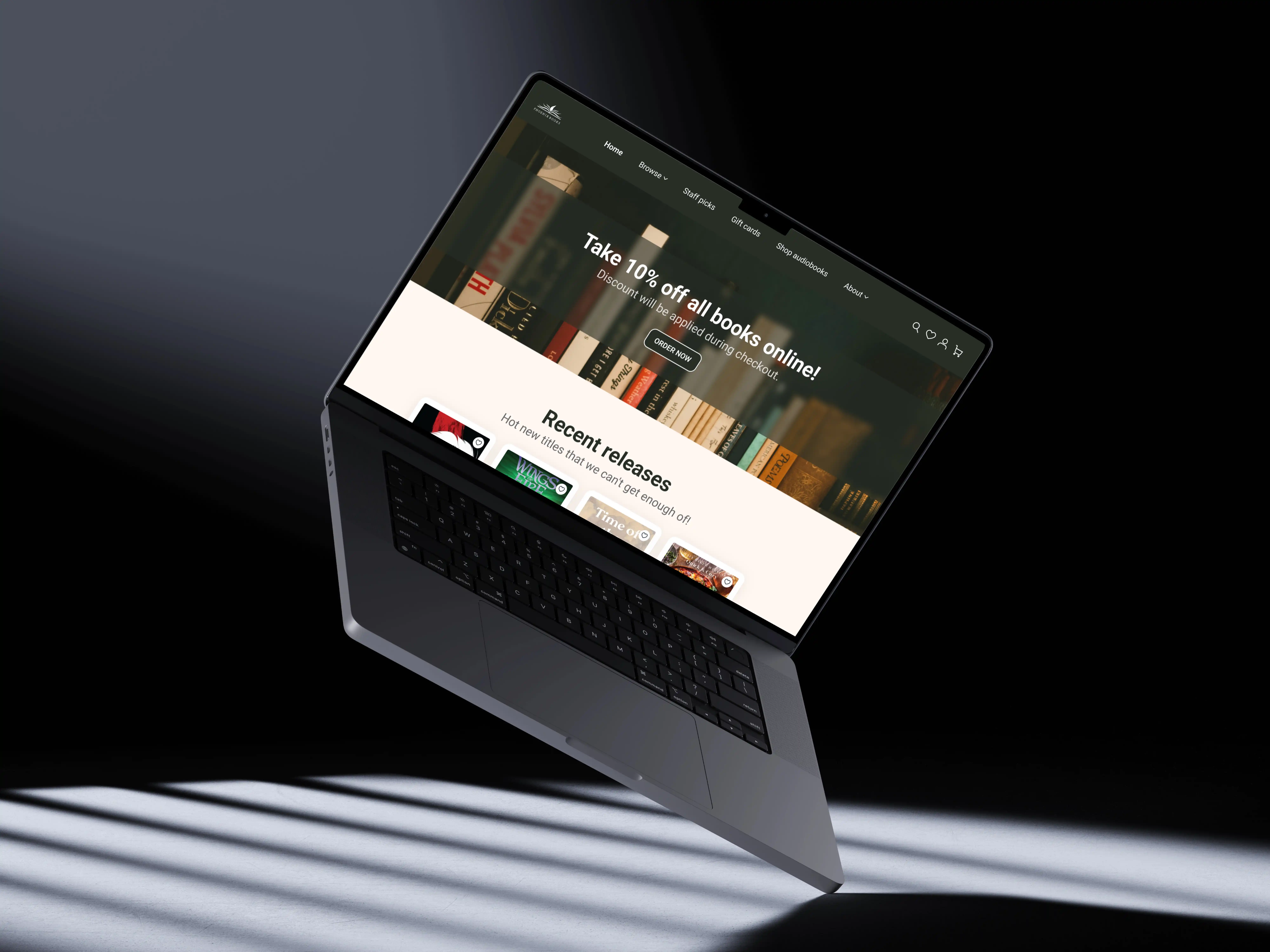
UX/UI

Phoenix Books

Restructuring the digital experience for an independent Canadian bookstore.

UX/UI

Phoenix Books

Restructuring the digital experience for an independent Canadian bookstore.

Metadata

•  Role: UX/UI Designer

•  Timeline: 2 weeks

•  Tools: Figma, Photoshop

•  Deliverables: Homepage Redesign, Responsive Layouts (Tablet & Mobile), Design System

The Overview

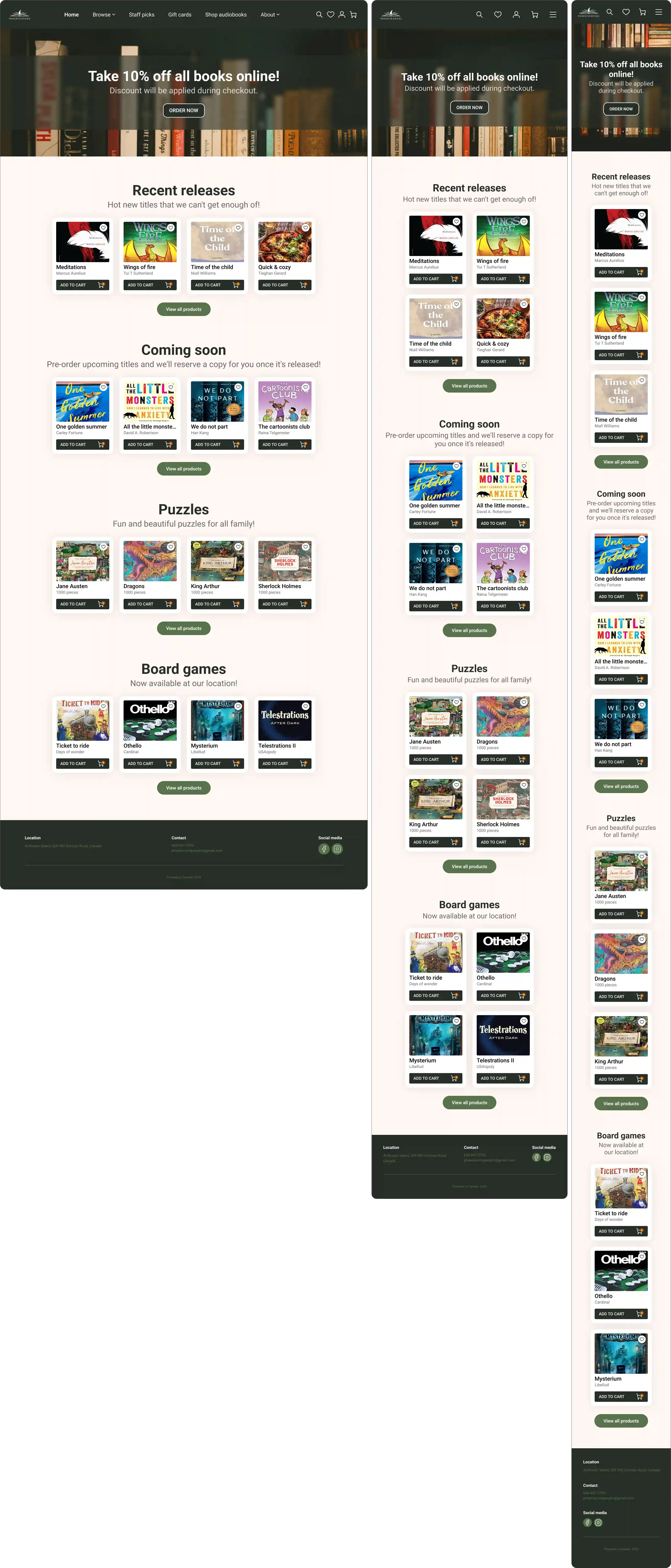
A full homepage redesign created to simplify navigation and optimize content discovery while reinforcing the bookstore’s warm, editorial brand identity.

https://phoenixbookstore.ca/

https://phoenixbookstore.ca/

About The Brand

Phoenix Books is an independent bookstore based in Canada. Known for its curated selection of books, games, and gifts, the store needed a digital platform that matched its rich physical atmosphere and community-driven essence.

Actual Content

Independent bookstore in Canada. The goal was to modernize their digital presence while preserving their warm, editorial identity.
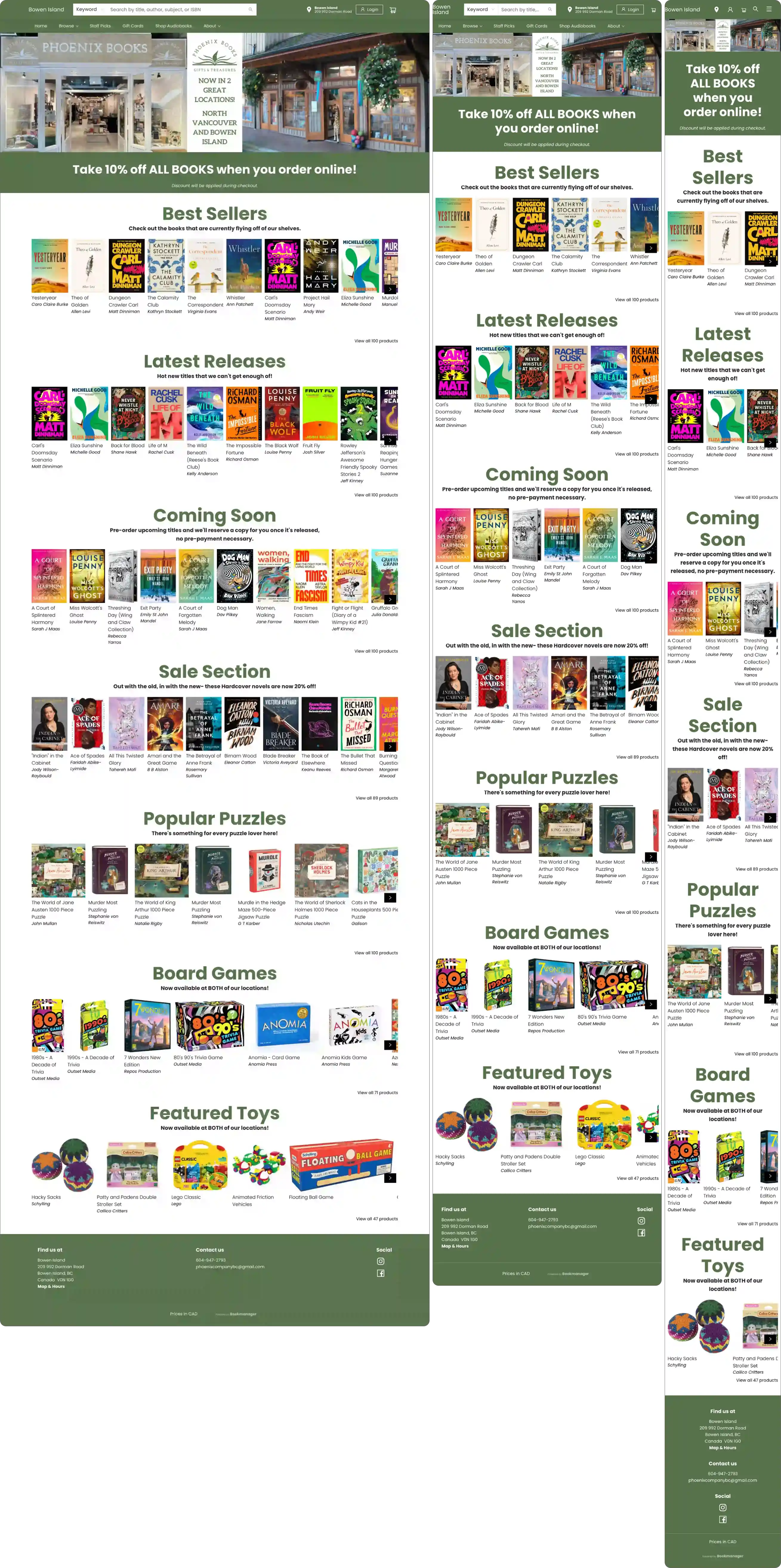
Actual Website (Source: https://phoenixbookstore.ca)

Actual Website (Source: https://phoenixbookstore.ca)

The Challenge

The original homepage suffered from usability friction and weak visual hierarchy: ∙ Cluttered navigation: Important categories were buried. ∙ Lack of visual hierarchy: Elements competed for attention without a clear reading flow. ∙ Weak editorial identity: The design felt outdated and didn't reflect the warmth of a local bookstore.

The Design Approach

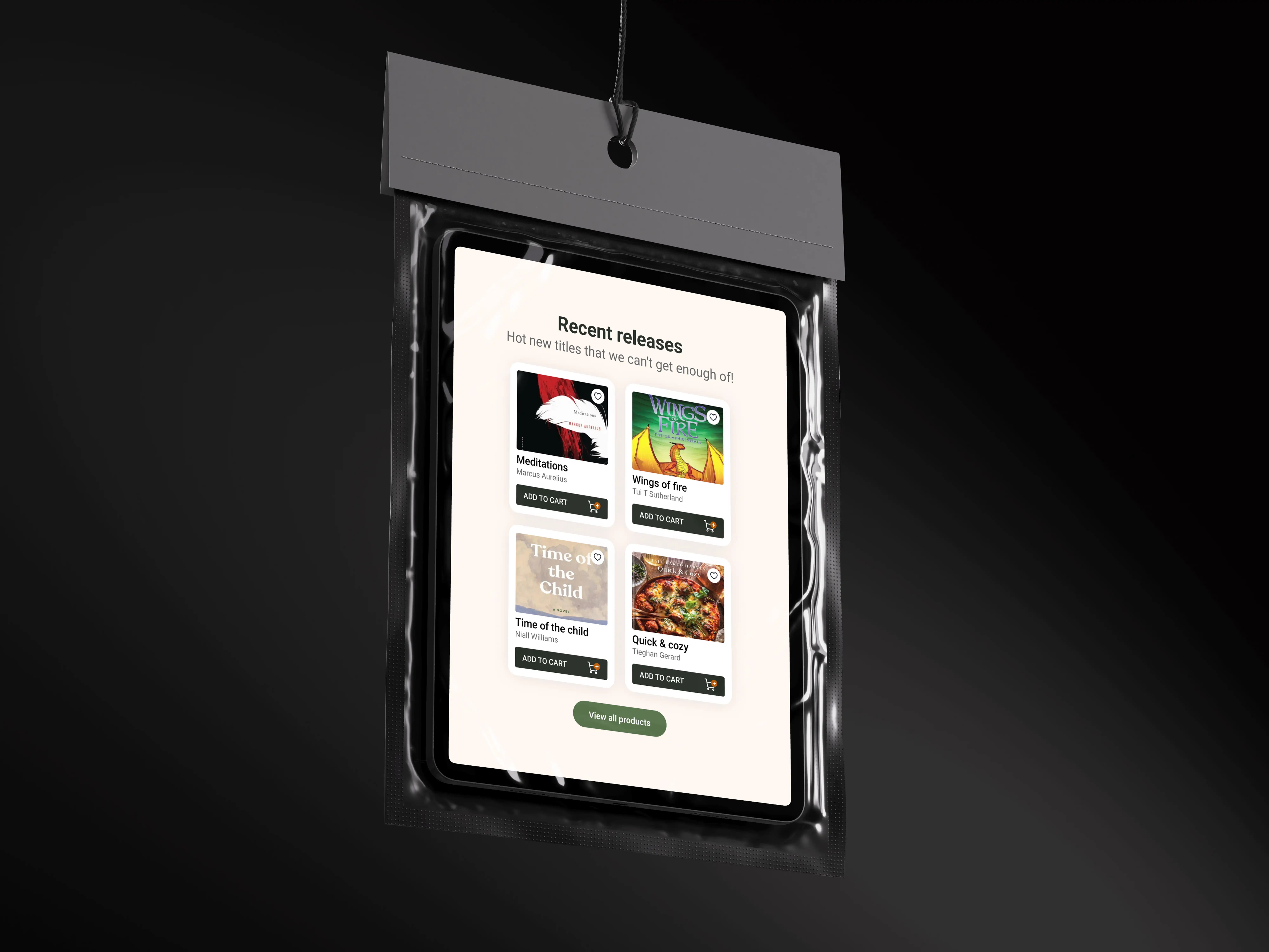
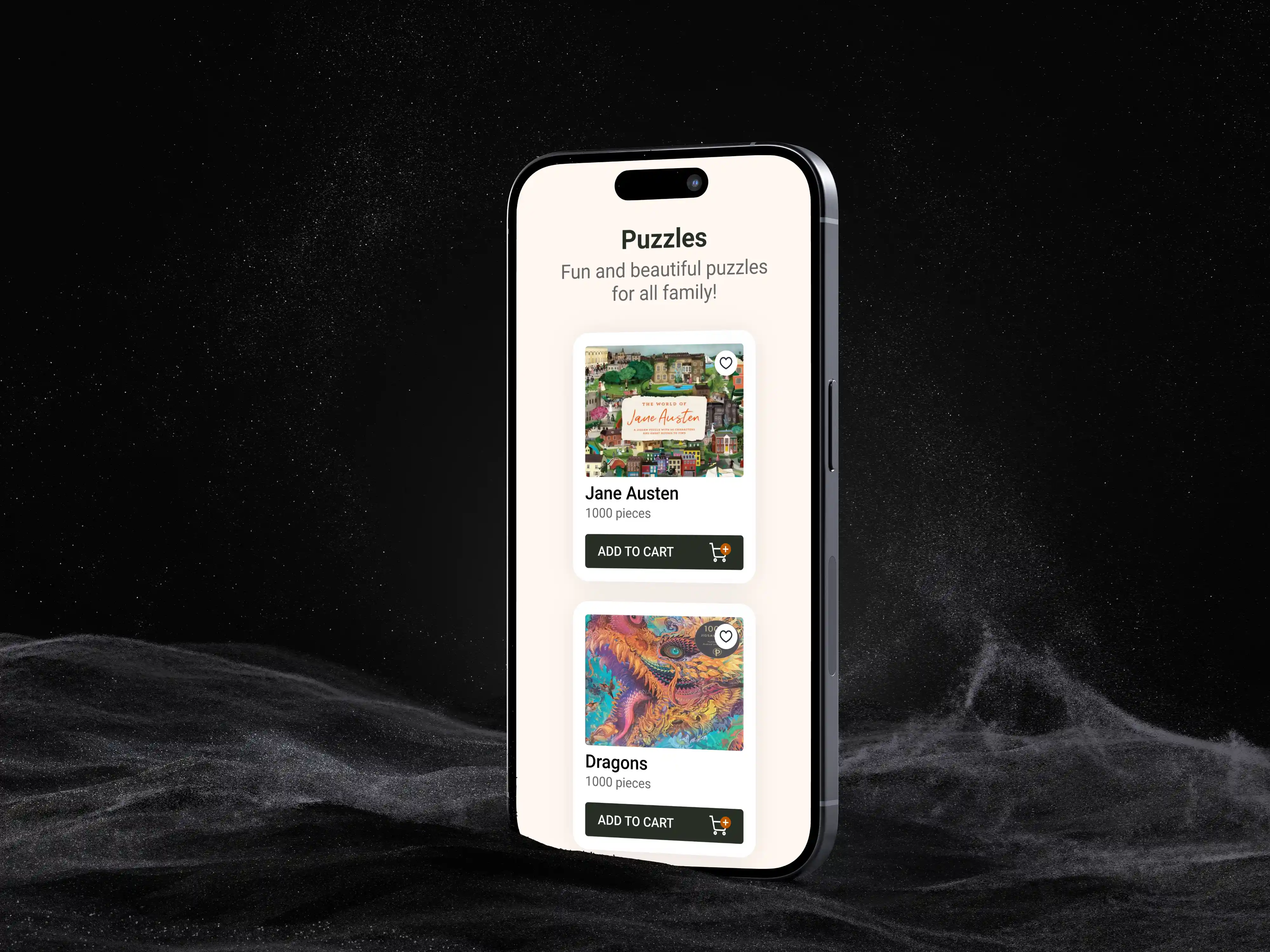
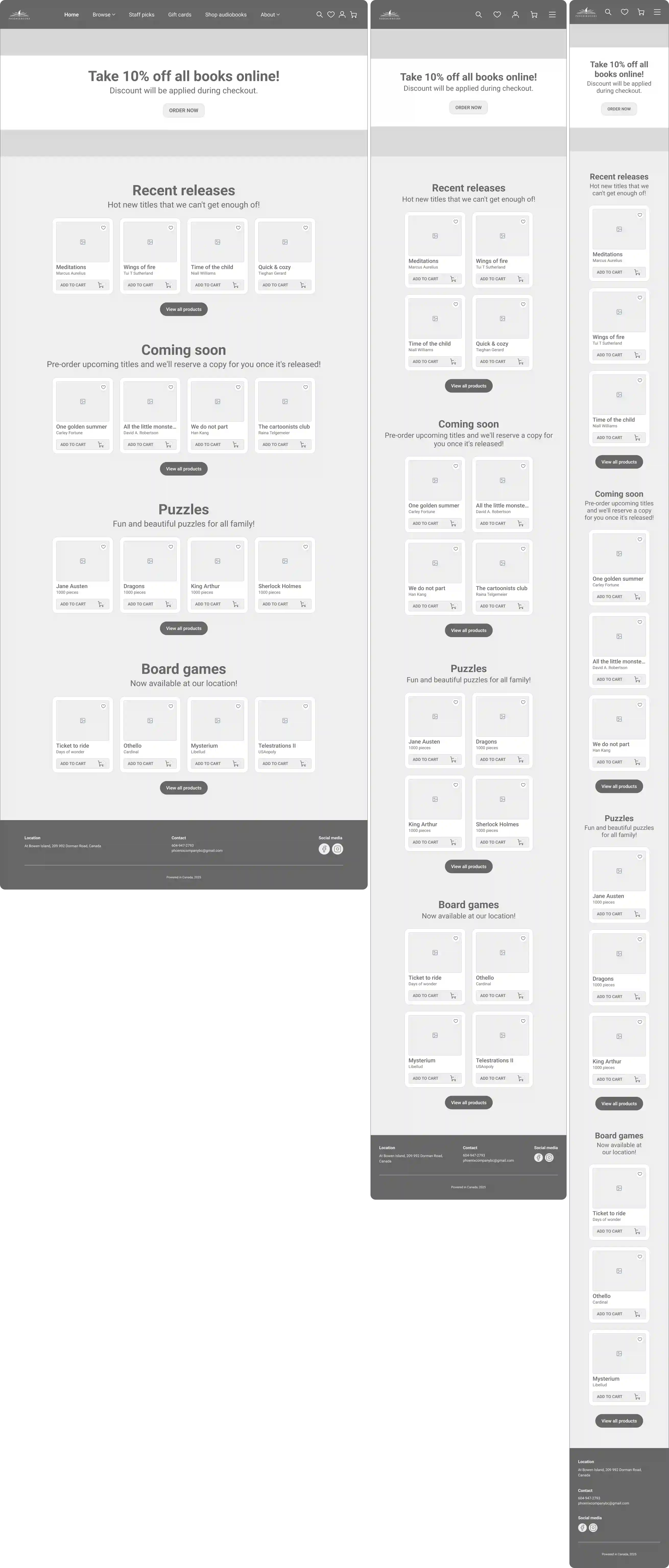
The redesign focused on restructuring the content hierarchy to guide the user naturally from promotions to discovery. ∙ Information Architecture: Reorganizing content sections (Best Sellers, Releases, Staff Picks) based on user interest. ∙ Layout Structure: Utilizing low-fidelity wireframing to test content density and spacing before adding visual polish. ∙ Readability & Scanning: Designing modular cards to make browsing titles intuitive on both desktop and mobile screens.

General Typeface: Roboto

Wireframes Hi-Fi

General Color Palette

#FFFFFF

#FFF7F2

#BD5800

#58734C

#666666

#262E26

Primary Colors

#262E26

#FFF7F2

Secondary Colors

#58734C

#BD5800

Neutral Colors

#FFFFFF

#666666

#262E26

Wireframes Lo-Fi

Prototype

The Design Approach

The redesign focused on restructuring the content hierarchy to guide the user naturally from promotions to discovery. ∙ Information Architecture: Reorganizing content sections (Best Sellers, Releases, Staff Picks) based on user interest. ∙ Layout Structure: Utilizing low-fidelity wireframing to test content density and spacing before adding visual polish. ∙ Readability & Scanning: Designing modular cards to make browsing titles intuitive on both desktop and mobile screens.

Wireframes Hi-Fi

General Typeface: Roboto

General Color Palette

#FFFFFF

#58734C

#FFF7F2

#666666

#BD5800

#262E26

Primary Colors

#262E26

#FFF7F2

Secondary Colors

#58734C

#BD5800

Neutral Colors

#FFFFFF

#666666

#262E26

Prototype

Wireframes Lo-Fi

The Design Approach

The redesign focused on restructuring the content hierarchy to guide the user naturally from promotions to discovery. ∙ Information Architecture: Reorganizing content sections (Best Sellers, Releases, Staff Picks) based on user interest. ∙ Layout Structure: Utilizing low-fidelity wireframing to test content density and spacing before adding visual polish. ∙ Readability & Scanning: Designing modular cards to make browsing titles intuitive on both desktop and mobile screens.

General Color Palette

#FFFFFF

#58734C

#FFF7F2

#666666

#BD5800

#262E26

Primary Colors

#262E26

#FFF7F2

Secondary Colors

#58734C

#BD5800

Neutral Colors

#FFFFFF

#666666

#262E26

General Typeface: Roboto

Wireframes Lo-Fi

Wireframes Hi-Fi

Prototype

UI Solution

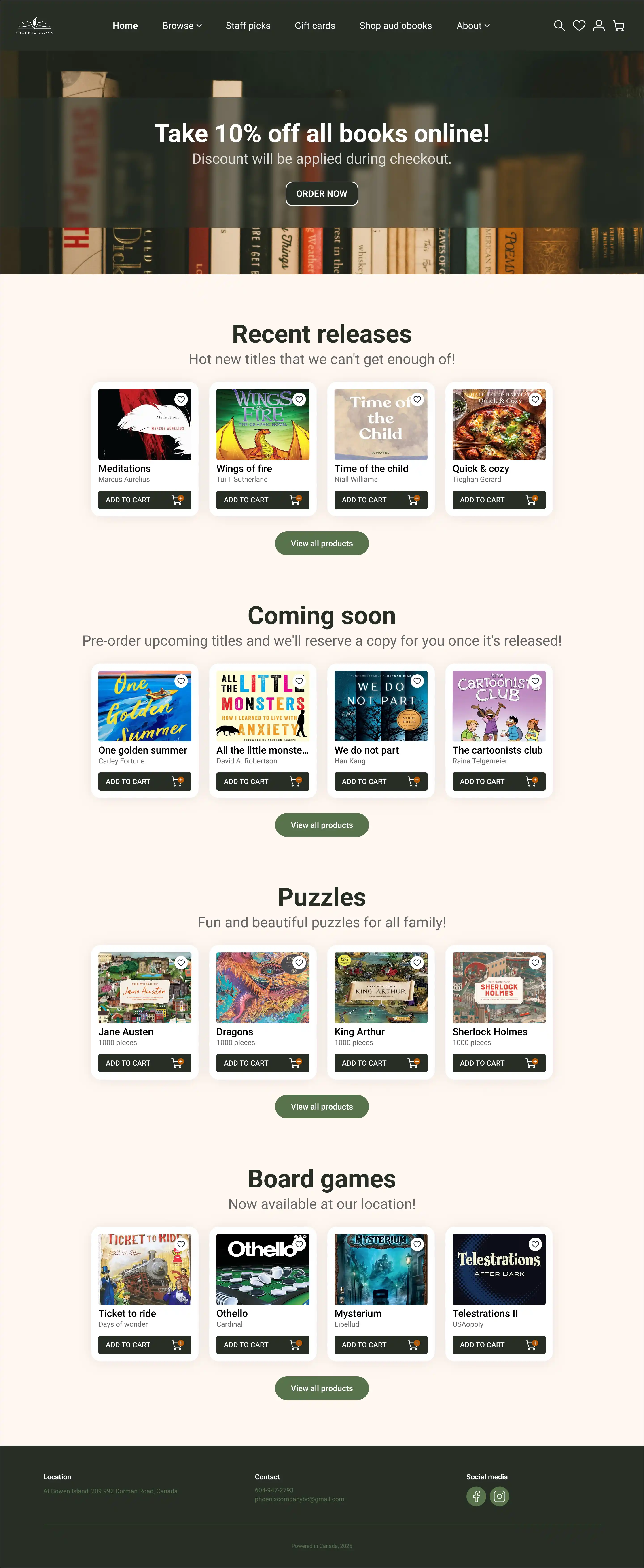
The new interface introduces an elevated editorial feel with clear visual cues: - Typography: A strong serif heading paired with a clean sans-serif for optimal legibility. - Color Palette: Warm background tones combined with deep forest greens to invoke a cozy, literary atmosphere. - Responsive Layouts: Seamless adaptation across Desktop (1440px), Tablet (768px), and Mobile (390px) viewpoints.

UI Solution

The new interface introduces an elevated editorial feel with clear visual cues: - Typography: A strong serif heading paired with a clean sans-serif for optimal legibility. - Color Palette: Warm background tones combined with deep forest greens to invoke a cozy, literary atmosphere. - Responsive Layouts: Seamless adaptation across Desktop (1440px), Tablet (768px), and Mobile (390px) viewpoints.

Design System

To ensure visual consistency and seamless implementation, I established a lightweight design system. This includes a warm, editorial color palette, a structured typography scale pairing serif headers with readable sans-serif body text, and reusable UI components built for responsive adaptability.

The Outcome

The redesigned homepage improves browsing clarity, readability and overall user engagement.

More Projects
Slide 1 of 1
Slide 1 of 1
Page 1 of 1

UX/UI

Phoenix Books

Restructuring the digital experience for an independent Canadian bookstore.

UX/UI

Phoenix Books

Restructuring the digital experience for an independent Canadian bookstore.

Metadata

•  Role: UX/UI Designer

•  Timeline: 2 weeks

•  Tools: Figma, Photoshop

•  Deliverables: Homepage Redesign, Responsive Layouts (Tablet & Mobile), Design System

The Overview

A full homepage redesign created to simplify navigation and optimize content discovery while reinforcing the bookstore’s warm, editorial brand identity.

https://phoenixbookstore.ca/

https://phoenixbookstore.ca/

About The Brand

Phoenix Books is an independent bookstore based in Canada. Known for its curated selection of books, games, and gifts, the store needed a digital platform that matched its rich physical atmosphere and community-driven essence.

Actual Content

Independent bookstore in Canada. The goal was to modernize their digital presence while preserving their warm, editorial identity.

Actual Website (Source: https://phoenixbookstore.ca)

Actual Website (Source: https://phoenixbookstore.ca)

The Challenge

The original homepage suffered from usability friction and weak visual hierarchy: ∙ Cluttered navigation: Important categories were buried. ∙ Lack of visual hierarchy: Elements competed for attention without a clear reading flow. ∙ Weak editorial identity: The design felt outdated and didn't reflect the warmth of a local bookstore.

The Design Approach

The redesign focused on restructuring the content hierarchy to guide the user naturally from promotions to discovery. ∙ Information Architecture: Reorganizing content sections (Best Sellers, Releases, Staff Picks) based on user interest. ∙ Layout Structure: Utilizing low-fidelity wireframing to test content density and spacing before adding visual polish. ∙ Readability & Scanning: Designing modular cards to make browsing titles intuitive on both desktop and mobile screens.

General Typeface: Roboto

Wireframes Hi-Fi

General Color Palette

#FFFFFF

#FFF7F2

#BD5800

#58734C

#666666

#262E26

Primary Colors

#262E26

#FFF7F2

Secondary Colors

#58734C

#BD5800

Neutral Colors

#FFFFFF

#666666

#262E26

Wireframes Lo-Fi

Prototype

The Design Approach

The redesign focused on restructuring the content hierarchy to guide the user naturally from promotions to discovery. ∙ Information Architecture: Reorganizing content sections (Best Sellers, Releases, Staff Picks) based on user interest. ∙ Layout Structure: Utilizing low-fidelity wireframing to test content density and spacing before adding visual polish. ∙ Readability & Scanning: Designing modular cards to make browsing titles intuitive on both desktop and mobile screens.

Wireframes Hi-Fi

General Typeface: Roboto

General Color Palette

#FFFFFF

#58734C

#FFF7F2

#666666

#BD5800

#262E26

Primary Colors

#262E26

#FFF7F2

Secondary Colors

#58734C

#BD5800

Neutral Colors

#FFFFFF

#666666

#262E26

Prototype

Wireframes Lo-Fi

The Design Approach

The redesign focused on restructuring the content hierarchy to guide the user naturally from promotions to discovery. ∙ Information Architecture: Reorganizing content sections (Best Sellers, Releases, Staff Picks) based on user interest. ∙ Layout Structure: Utilizing low-fidelity wireframing to test content density and spacing before adding visual polish. ∙ Readability & Scanning: Designing modular cards to make browsing titles intuitive on both desktop and mobile screens.

General Color Palette

#FFFFFF

#58734C

#FFF7F2

#666666

#BD5800

#262E26

Primary Colors

#262E26

#FFF7F2

Secondary Colors

#58734C

#BD5800

Neutral Colors

#FFFFFF

#666666

#262E26

General Typeface: Roboto

Wireframes Lo-Fi

Wireframes Hi-Fi

Prototype

UI Solution

The new interface introduces an elevated editorial feel with clear visual cues: - Typography: A strong serif heading paired with a clean sans-serif for optimal legibility. - Color Palette: Warm background tones combined with deep forest greens to invoke a cozy, literary atmosphere. - Responsive Layouts: Seamless adaptation across Desktop (1440px), Tablet (768px), and Mobile (390px) viewpoints.

UI Solution

The new interface introduces an elevated editorial feel with clear visual cues: - Typography: A strong serif heading paired with a clean sans-serif for optimal legibility. - Color Palette: Warm background tones combined with deep forest greens to invoke a cozy, literary atmosphere. - Responsive Layouts: Seamless adaptation across Desktop (1440px), Tablet (768px), and Mobile (390px) viewpoints.

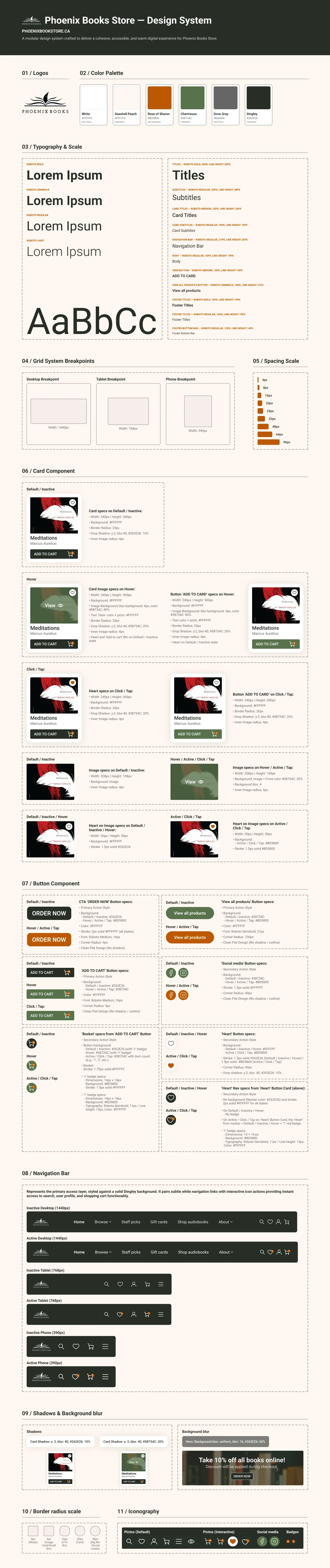
Design System

To ensure visual consistency and seamless implementation, I established a lightweight design system. This includes a warm, editorial color palette, a structured typography scale pairing serif headers with readable sans-serif body text, and reusable UI components built for responsive adaptability.
The Outcome

The redesigned homepage improves browsing clarity, readability and overall user engagement.

More Projects
Slide 1 of 1
Slide 1 of 1
Page 1 of 1