Product

Airbnb

A redesign of the Airbnb check-in experience focused on reducing friction, improving clarity and creating a smoother arrival journey for travelers.

Product

Airbnb

A redesign of the Airbnb check-in experience focused on reducing friction, improving clarity and creating a smoother arrival journey for travelers.

Metadata

•  Role: Product Designer

•  Timeline: 2 weeks

•  Tool: Figma

•  Deliverables: UX Audit, User Flow, Interactive Prototypes, High-Fidelity UI Screens

The Overview

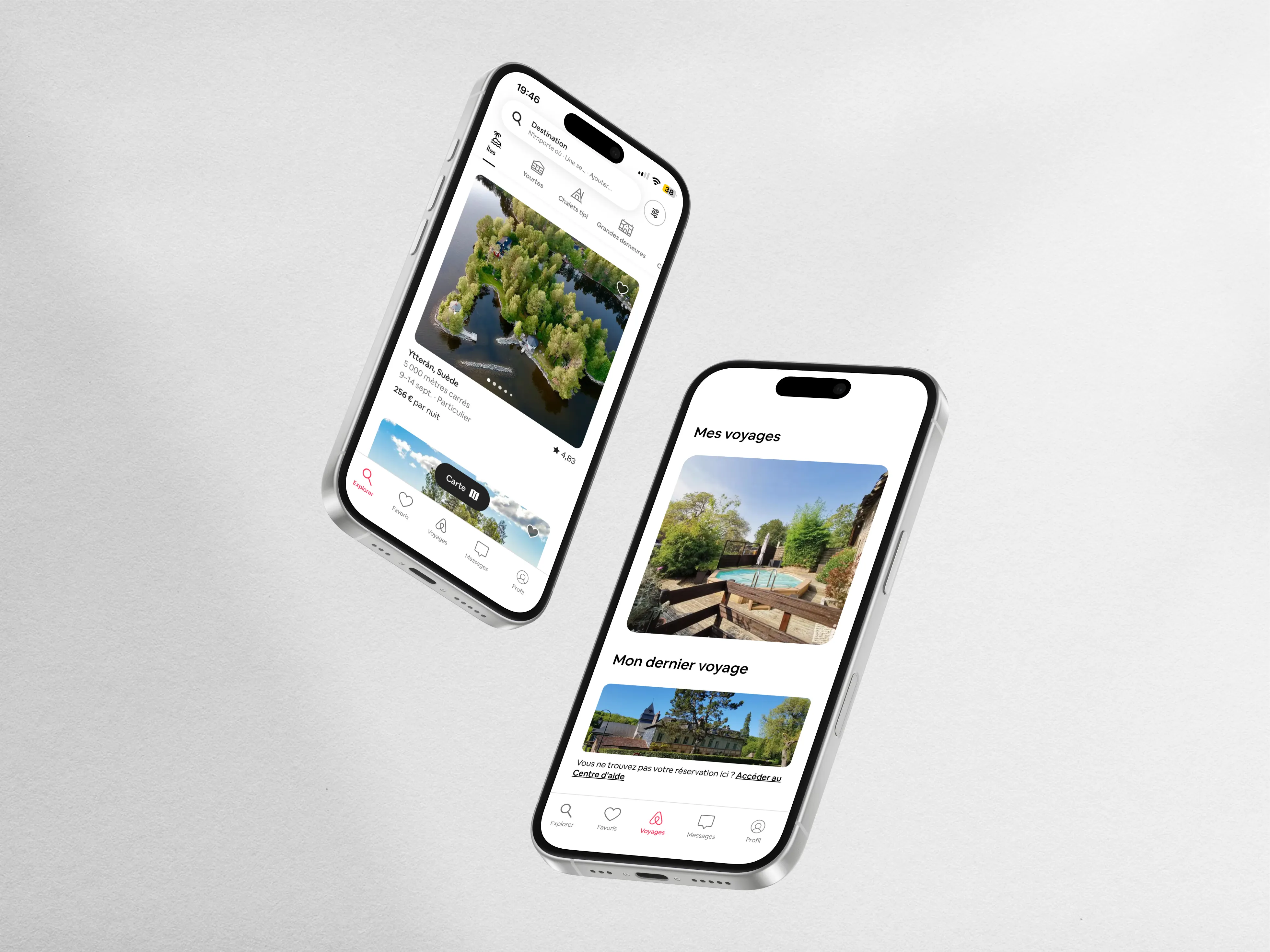
A mobile-first experience designed to simplify access to essential check-in information and reduce arrival stress.
Source : https://logo-marque.com/

Source : https://logo-marque.com/

About The Brand

Global hospitality platform connecting travelers with unique accommodations and local experiences.

Actual Content

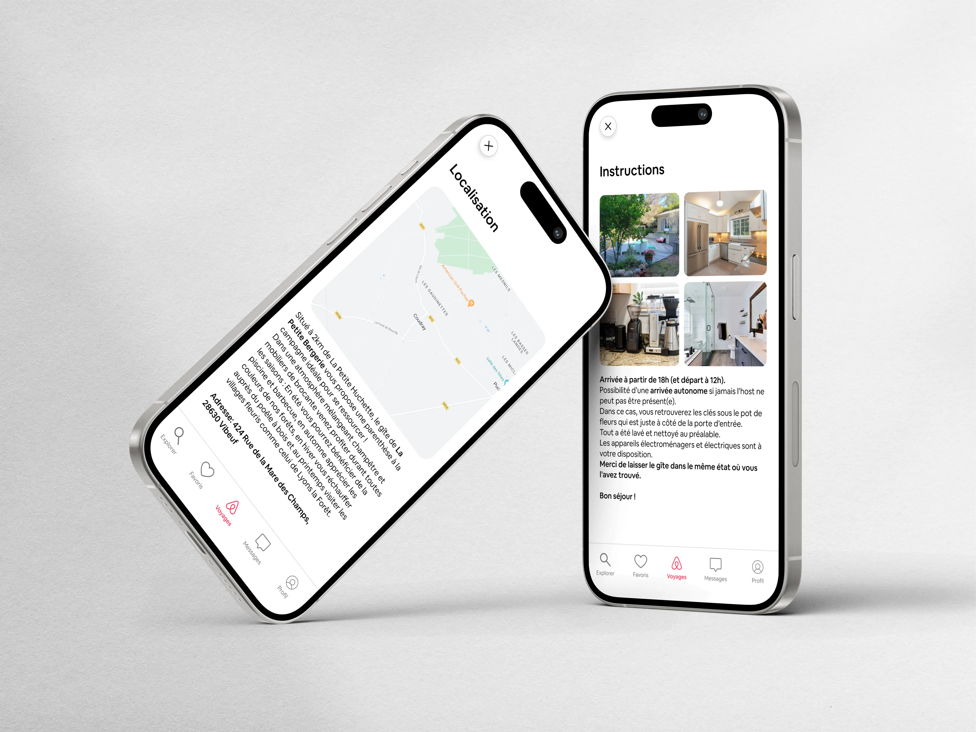
Arrival friction points: guests often struggled with unclear arrival instructions, key handover, and offline access to check-in guides.

Actual Experience

Actual Experience

The Challenge

The original journey suffered from: ∙ scattered information, ∙ unclear instructions, ∙ navigation friction, ∙ lack of real-time guidance.

The Design Approach

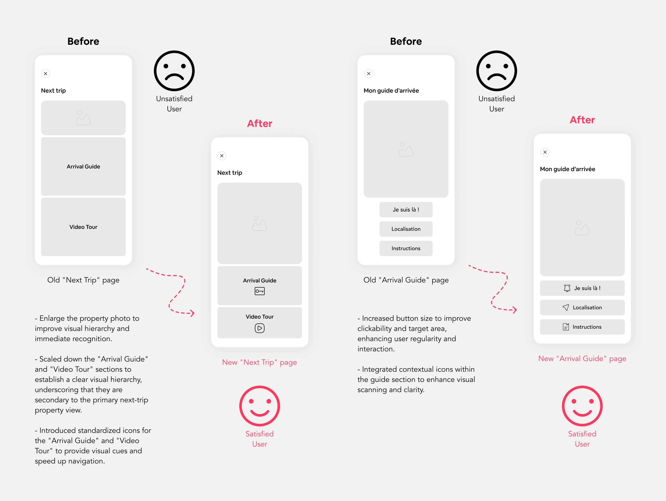
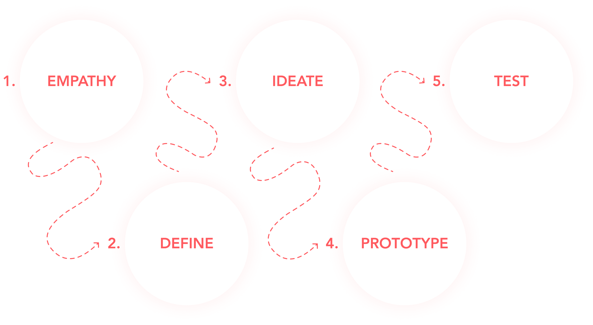
The redesign focused on: ∙ simplifying user flows, ∙ improving information hierarchy, ∙ centralizing key actions, ∙ creating a calmer mobile experience.

Design Thinking — 5-Steps

Secondary Typeface: Airbnb Cereal Medium

Competitive Analysis

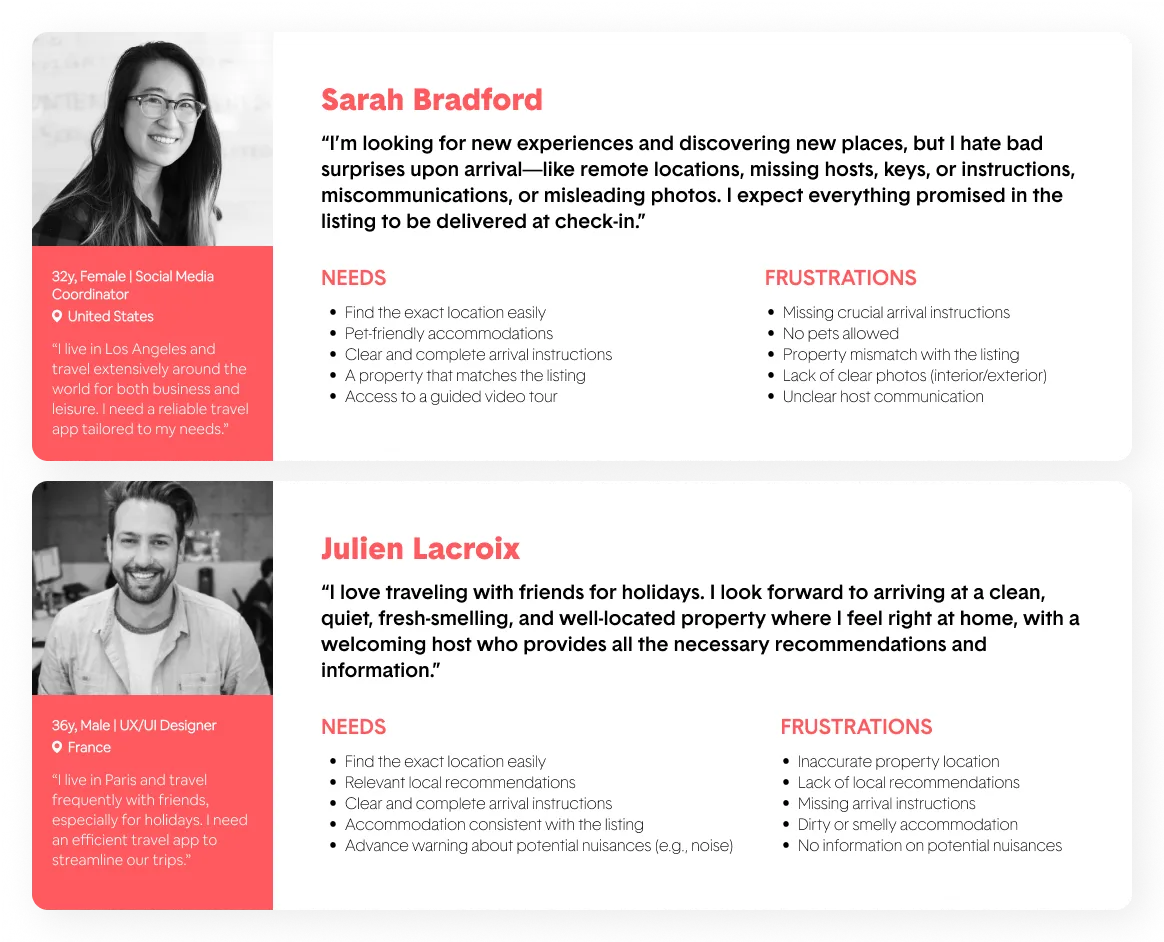
User's Personas

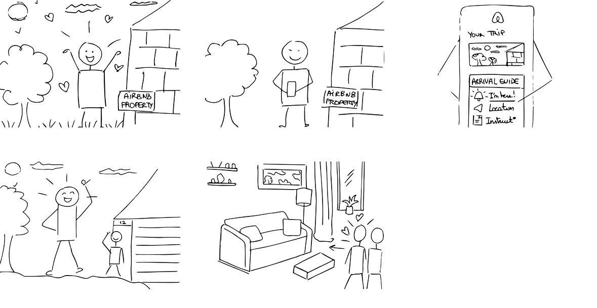
Storyboard (Future Experience)

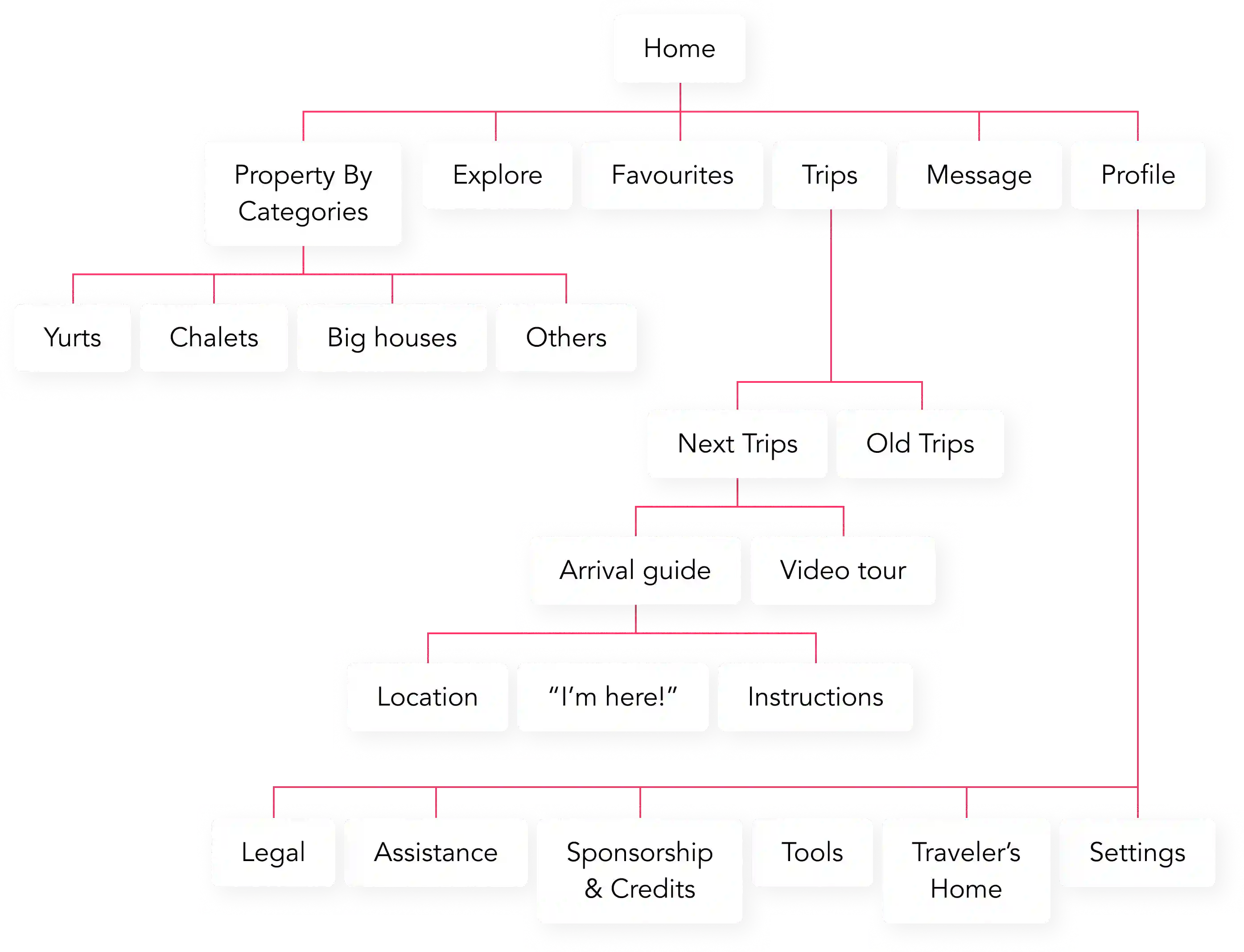
Site Map

Wireframes Hi-Fi

Test A/B

General Color Palette

#FFFFFF

#FFF3F3

#FF5A5F

#F02853

#E31C5F

#717171

Primary Color

#FF5A5F

#F02853

Secondary Colors

#E31C5F

#FFF3F3

Neutral Colors

#FFFFFF

#DDDDDD

#717171

Primary Typeface: Airbnb Cereal Regular

Benchmark

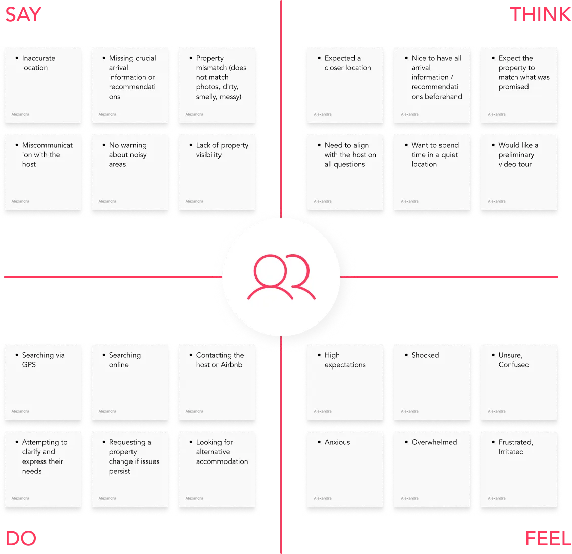
Empathy Map

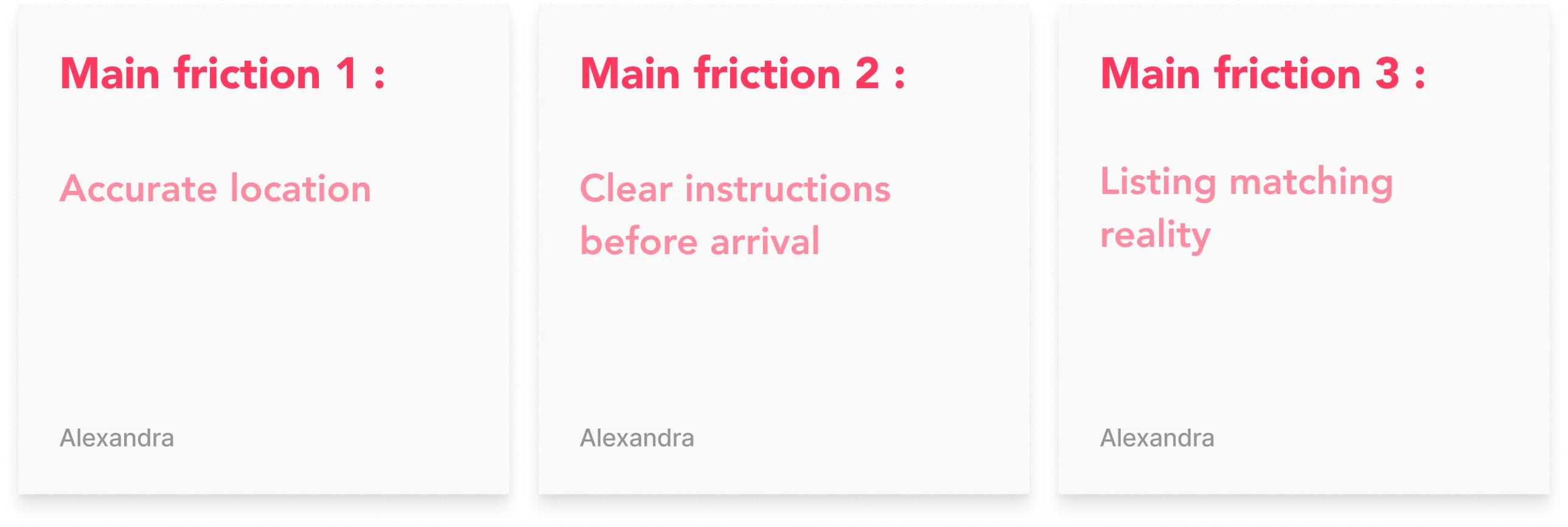
Frictions Points

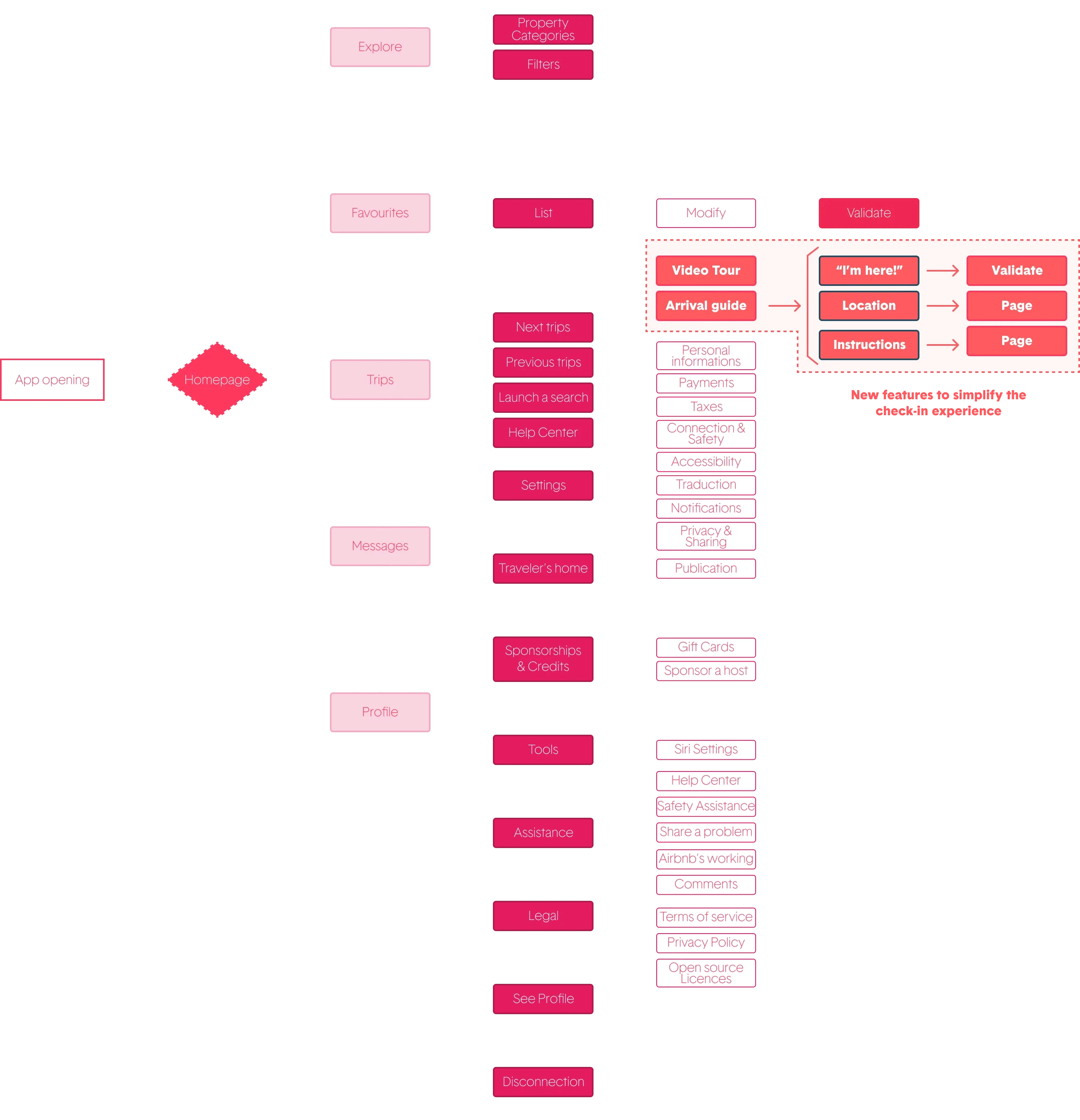
Userflow

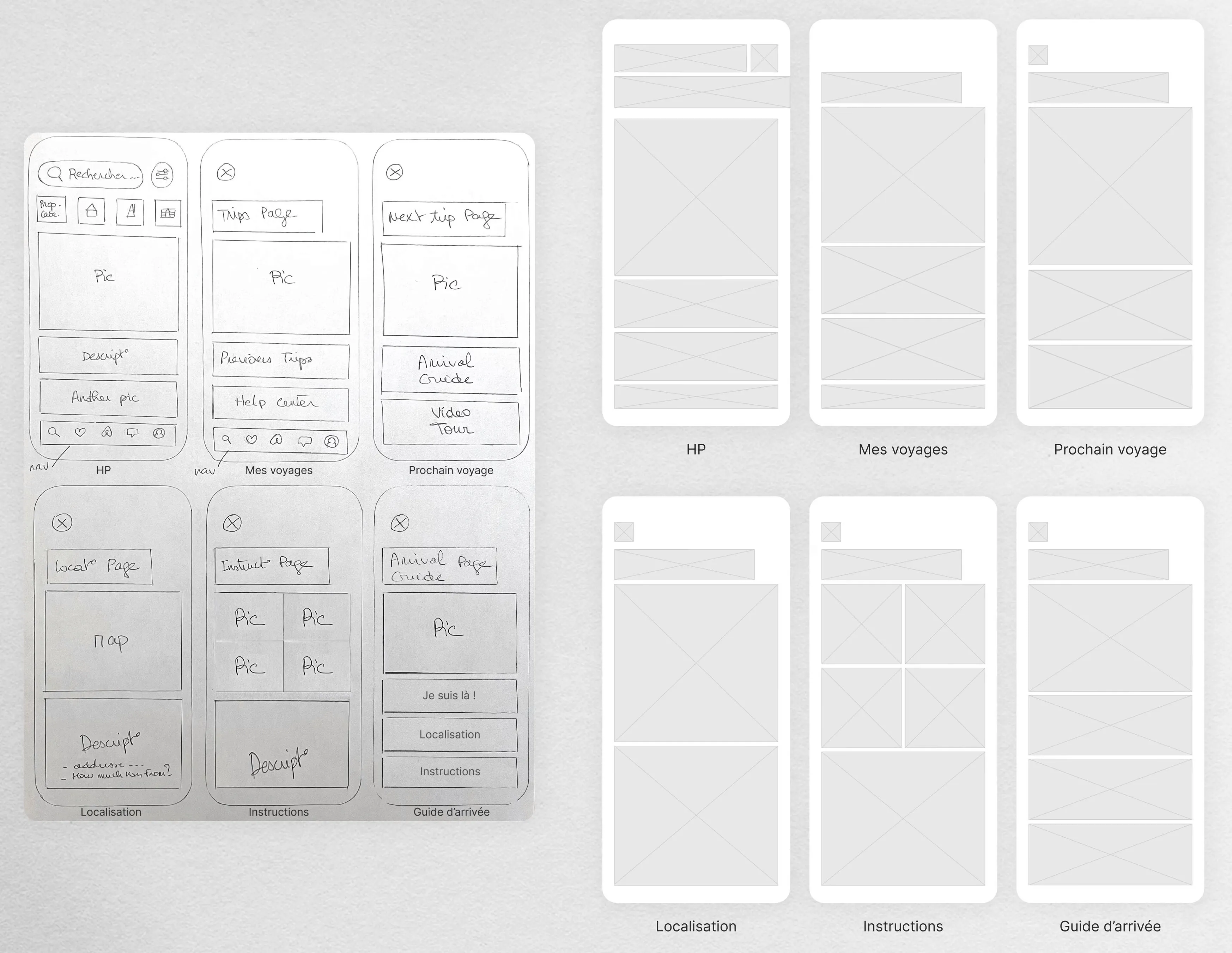
Wireframes Lo-Fi

Prototype

The Design Approach

The redesign focused on: ∙ simplifying user flows, ∙ improving information hierarchy, ∙ centralizing key actions, ∙ creating a calmer mobile experience.

Design Thinking — 5-Steps

Competitive Analysis

User's Personas

Storyboard (Future Experience)

Site Map

Wireframes Hi-Fi

Test A/B

Secondary Typeface: Airbnb Cereal Medium

General Color Palette

#FFFFFF

#F02853

#FFF3F3

#E31C5F

#FF5A5F

#717171

Primary Color

#FF5A5F

#F02853

Secondary Colors

#E31C5F

#FFF3F3

Neutral Colors

#FFFFFF

#DDDDDD

#717171

Benchmark

Empathy Map

Frictions Points

Userflow

Wireframes Lo-Fi

Prototype

Primary Typeface: Airbnb Cereal Regular

The Design Approach

The redesign focused on: ∙ simplifying user flows, ∙ improving information hierarchy, ∙ centralizing key actions, ∙ creating a calmer mobile experience.

General Color Palette

#FFFFFF

#F02853

#FFF3F3

#E31C5F

#FF5A5F

#717171

Primary Color

#FF5A5F

#F02853

Secondary Colors

#E31C5F

#FFF3F3

Neutral Colors

#FFFFFF

#DDDDDD

#717171

Design Thinking — 5-Steps

Primary Typeface: Airbnb Cereal Regular

Secondary Typeface: Airbnb Cereal Medium

Benchmark

Competitive Analysis

Empathy Map

User's Personas

Frictions Points

Storyboard (Future Experience)

Userflow

Site Map

Wireframes Lo-Fi

Wireframes Hi-Fi

Prototype

Test A/B

The Solution

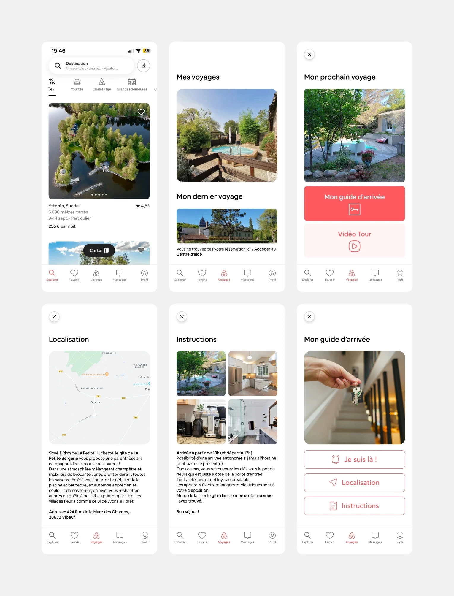
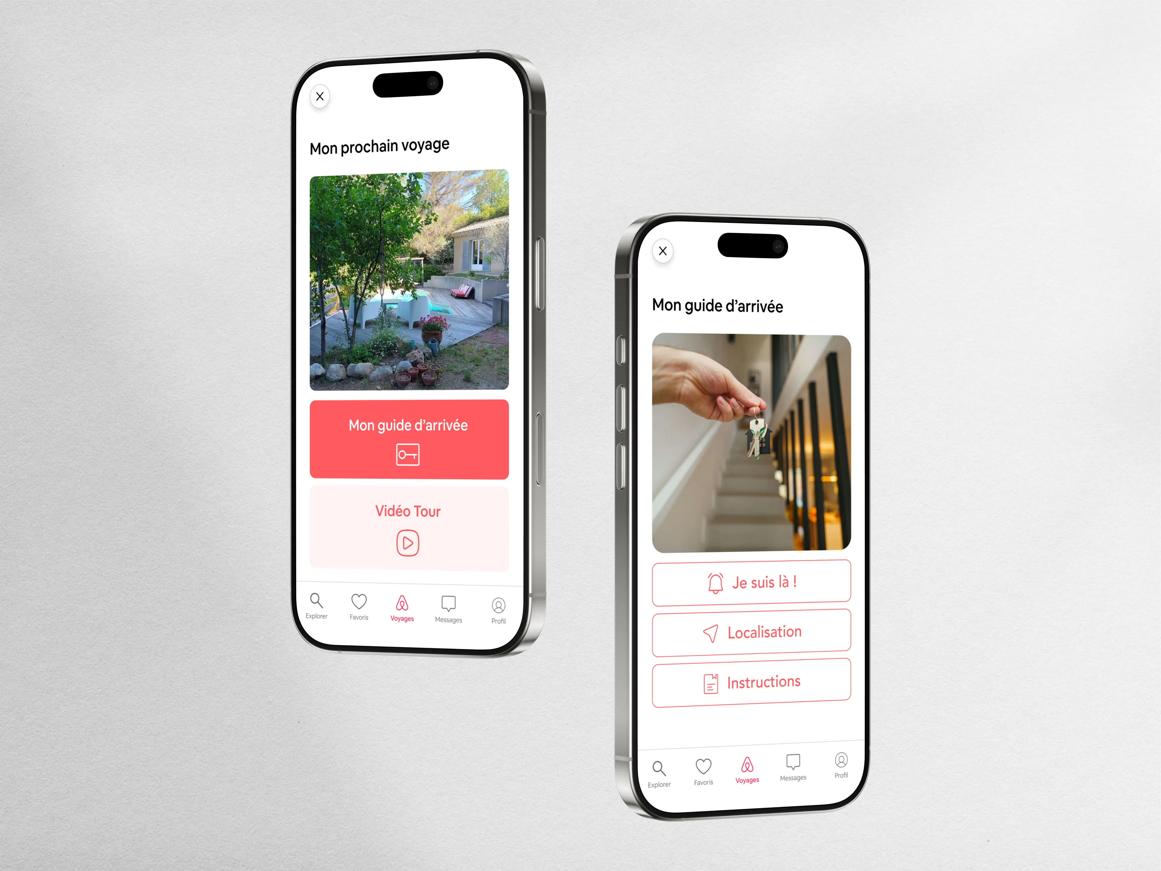
The new experience introduced: ∙ a centralized check-in dashboard, ∙ clearer arrival instructions, ∙ contextual guidance, ∙ more intuitive mobile interactions.

The Solution

The new experience introduced: ∙ a centralized check-in dashboard, ∙ clearer arrival instructions, ∙ contextual guidance, ∙ more intuitive mobile interactions.

Design System

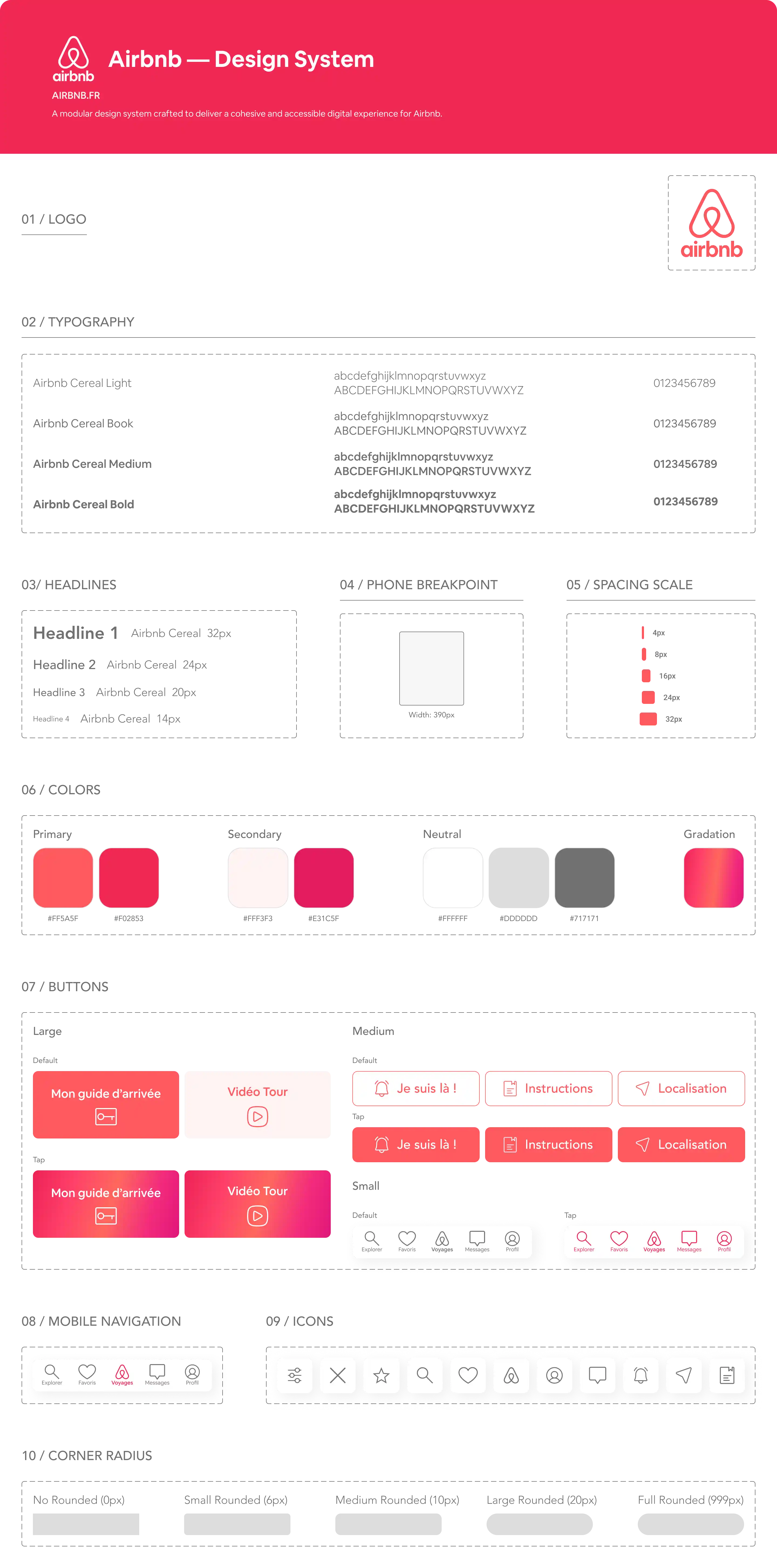
To ensure visual consistency and seamless implementation, I established a lightweight design system. This includes an editorial color palette, a structured typography scale pairing serif headers with readable sans-serif body text, and reusable UI components.

The Outcome

The redesigned journey improves clarity, accessibility and overall user confidence during check-in.

More Projects
Slide 1 of 1
Slide 1 of 1
Page 1 of 1

Product

Airbnb

A redesign of the Airbnb check-in experience focused on reducing friction, improving clarity and creating a smoother arrival journey for travelers.

Product

Airbnb

A redesign of the Airbnb check-in experience focused on reducing friction, improving clarity and creating a smoother arrival journey for travelers.

Metadata

•  Role: Product Designer

•  Timeline: 2 weeks

•  Tool: Figma

•  Deliverables: UX Audit, User Flow, Interactive Prototypes, High-Fidelity UI Screens

The Overview

A mobile-first experience designed to simplify access to essential check-in information and reduce arrival stress.

Source : https://logo-marque.com/

Source : https://logo-marque.com/

About The Brand

Global hospitality platform connecting travelers with unique accommodations and local experiences.

Actual Content

Arrival friction points: guests often struggled with unclear arrival instructions, key handover, and offline access to check-in guides.

Actual Experience

Actual Experience

The Challenge

The original journey suffered from: ∙ scattered information, ∙ unclear instructions, ∙ navigation friction, ∙ lack of real-time guidance.

The Design Approach

The redesign focused on: ∙ simplifying user flows, ∙ improving information hierarchy, ∙ centralizing key actions, ∙ creating a calmer mobile experience.

Design Thinking — 5-Steps

Secondary Typeface: Airbnb Cereal Medium

Competitive Analysis

User's Personas

Storyboard (Future Experience)

Site Map

Wireframes Hi-Fi

Test A/B

General Color Palette

#FFFFFF

#FFF3F3

#FF5A5F

#F02853

#E31C5F

#717171

Primary Color

#FF5A5F

#F02853

Secondary Colors

#E31C5F

#FFF3F3

Neutral Colors

#FFFFFF

#DDDDDD

#717171

Primary Typeface: Airbnb Cereal Regular

Benchmark

Empathy Map

Frictions Points

Userflow

Wireframes Lo-Fi

Prototype

The Design Approach

The redesign focused on: ∙ simplifying user flows, ∙ improving information hierarchy, ∙ centralizing key actions, ∙ creating a calmer mobile experience.

Design Thinking — 5-Steps

Competitive Analysis

User's Personas

Storyboard (Future Experience)

Site Map

Wireframes Hi-Fi

Test A/B

Secondary Typeface: Airbnb Cereal Medium

General Color Palette

#FFFFFF

#F02853

#FFF3F3

#E31C5F

#FF5A5F

#717171

Primary Color

#FF5A5F

#F02853

Secondary Colors

#E31C5F

#FFF3F3

Neutral Colors

#FFFFFF

#DDDDDD

#717171

Benchmark

Empathy Map

Frictions Points

Userflow

Wireframes Lo-Fi

Prototype

Primary Typeface: Airbnb Cereal Regular

The Design Approach

The redesign focused on: ∙ simplifying user flows, ∙ improving information hierarchy, ∙ centralizing key actions, ∙ creating a calmer mobile experience.

General Color Palette

#FFFFFF

#F02853

#FFF3F3

#E31C5F

#FF5A5F

#717171

Primary Color

#FF5A5F

#F02853

Secondary Colors

#E31C5F

#FFF3F3

Neutral Colors

#FFFFFF

#DDDDDD

#717171

Design Thinking — 5-Steps

Primary Typeface: Airbnb Cereal Regular

Secondary Typeface: Airbnb Cereal Medium

Benchmark

Competitive Analysis

Empathy Map

User's Personas

Frictions Points

Storyboard (Future Experience)

Userflow

Site Map

Wireframes Lo-Fi

Wireframes Hi-Fi

Prototype

Test A/B

The Solution

The new experience introduced: ∙ a centralized check-in dashboard, ∙ clearer arrival instructions, ∙ contextual guidance, ∙ more intuitive mobile interactions.

The Solution

The new experience introduced: ∙ a centralized check-in dashboard, ∙ clearer arrival instructions, ∙ contextual guidance, ∙ more intuitive mobile interactions.

Design System

To ensure visual consistency and seamless implementation, I established a lightweight design system. This includes an editorial color palette, a structured typography scale pairing serif headers with readable sans-serif body text, and reusable UI components.
The Outcome

The redesigned journey improves clarity, accessibility and overall user confidence during check-in.

More Projects
Slide 1 of 1
Slide 1 of 1
Page 1 of 1